0 members and 5,991 guests
No Members online

» Site Navigation

» Stats
Members: 35,443
Threads: 103,072
Posts: 826,684
Top Poster: cc.RadillacVIII (7,429)
|
-
 New halo themed sig New halo themed sig
so after having the game for a while and never making a sig i felt the need to do that today
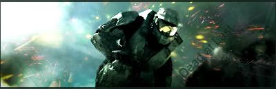
I was thinking maybe getting the a better font so it would blend in more
-
The first thing that jumps out at me is the colors.
There are A LOT of them ;P.
I would recommend getting rid of some of them by working with photo filters, gradient maps and color balances.
Also the text. I recommend reading Dark method's text guide. One of the biggest tips i can give on text is to stick to defaults (which you did) however keep it small. You want your text small otherwise it is overwhelming and distracting.
Good border though, However i would like to see it all black.
Finally try blending master chief in more. I realize it's a stock so he's already blended in, however right now it doesn't looks so much like it. So add some stuff ontop of his sides and such to blend him in.
besides that good job. I like the effects and the way your going on this. keep at it.
 My DevART
RATCHET is my bitch
Andrew says:
u ever stolen a bible?
Apathy says:
no
used the last two pages to roll a joint though
Andrew says:
wow
thats fucking hard core
^^HAHAHA, dm sucks XD
-
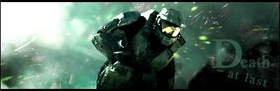
Ok so after adding a gradient map and looking at the text tutorial here is my outcome
-
V2 is much better. I like the text better too.
-
text still needs work, it's way too big.
-
I agree, the Death is a bit too big, but you got the rest of it spot on. besides that it's looking a lot better.
My DevART
RATCHET is my bitch
Andrew says:
u ever stolen a bible?
Apathy says:
no
used the last two pages to roll a joint though
Andrew says:
wow
thats fucking hard core
^^HAHAHA, dm sucks XD
-
the v2 looks so much better colors blend better but the text is still a bit clumsy try to redo that and you have a solid sig going
-
very nice still agree on the text, too big. still agree on the text, too big.
Similar Threads
-
By Bill-Kill in forum Sigs & Manips
Replies: 2
Last Post: 06-11-2007, 03:14 PM
-
By Wolf in forum Battlegrounds
Replies: 41
Last Post: 02-24-2007, 03:37 PM
-
By konfusion in forum Digital Art
Replies: 4
Last Post: 01-18-2007, 09:21 PM
-
By danielsaso in forum Sigs & Manips
Replies: 2
Last Post: 08-08-2006, 01:41 PM
-
By Echo in forum Sigs & Manips
Replies: 0
Last Post: 09-04-2005, 08:21 PM
 Posting Permissions
- You may not post new threads
- You may not post replies
- You may not post attachments
- You may not edit your posts
-
Forum Rules
|


 Reply With Quote


