0 members and 503 guests
No Members online

» Site Navigation

» Stats
Members: 35,443
Threads: 103,072
Posts: 826,684
Top Poster: cc.RadillacVIII (7,429)
|
-
 dragon sig... dragon sig...
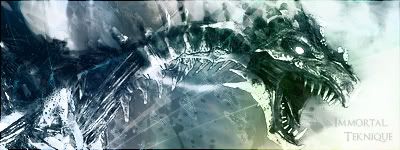
tired wen i made it..just wanted to give it a shot..
not my best work..but critique?
-
its cool the colors need something i think but im not sure what
lol its ok 7/10
-
yeah tru but thank u roar
-
The text is quite hard to see, but its nice
-
The colors are pretty cool. I like em. However I think you got your lighting off a bit. YOu need some of that light in the right hand bottom corner to extend a bit over to underneath the chin. He's got a highlight right on the edge of it and i feel like it's an important signal showing you need light below it.
Though the text isn't bad, it probably could be placed in a better place.
Awesome job though you have great blending, cool colors, and some pretty cool effects.
 My DevART
RATCHET is my bitch
Andrew says:
u ever stolen a bible?
Apathy says:
no
used the last two pages to roll a joint though
Andrew says:
wow
thats fucking hard core
^^HAHAHA, dm sucks XD
-
hmm...
I like it... ;]
really nice colors; ]
could work with text but thats alright ;D
Similar Threads
-
By Nightfire in forum Sigs & Manips
Replies: 6
Last Post: 11-05-2006, 03:05 PM
-
By gugge in forum Digital Art
Replies: 14
Last Post: 01-03-2006, 08:09 PM
-
By the_dude_of_darkness in forum Digital Art
Replies: 9
Last Post: 10-01-2005, 11:51 AM
-
By gugge in forum Digital Art
Replies: 7
Last Post: 08-22-2005, 04:35 PM
-
By jerner in forum Digital Art
Replies: 30
Last Post: 03-18-2005, 02:28 PM
 Posting Permissions
- You may not post new threads
- You may not post replies
- You may not post attachments
- You may not edit your posts
-
Forum Rules
|


 Reply With Quote