GFXVoid Graphic Design Forum

Remove Text Formatting
Loading...

» Online Users: 6,031

0 members and 6,031 guests
No Members online

» Site Navigation

 > FAQ

» Stats

Members: 35,443
Threads: 103,072
Posts: 826,684
Top Poster: cc.RadillacVIII (7,429)
Welcome to our newest member, Lekelindids
Results 1 to 7 of 7

Thread: newsigimade

  1. #1

    Default newsigimade

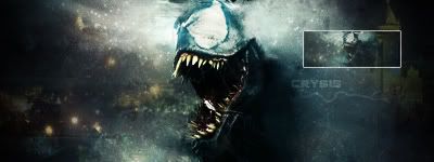
    how does this sig look?


    any comments??

  2. #2
    Join Date
    Jul 2007
    Location
    Lithuania
    Posts
    3,611

    Default

    this looks really great. ;]
    but I miss the text ;[


  3. #3

    Default

    thx
    yea i should've made it more visible

  4. #4
    Join Date
    Sep 2007
    Location
    Czech Republic
    Posts
    194

    Default

    i dont know what is this.... :/
    Favourite


  5. #5
    Join Date
    Mar 2008
    Location
    holland
    Posts
    48

    Default

    Nice Nice,
    But a Border is nicer...
    and make it a littlebit sharper

    I'm From Holland, Where the F*ck you From..


  6. #6
    Join Date
    Mar 2007
    Location
    Oslo, Norway
    Posts
    1,509

    Default

    i really cant tell what the render is=/
    but very nice looking
    nice depth too

    Formerly known as silentshadow
    http://flickr.com/aeilertsen

  7. #7
    Join Date
    Jun 2007
    Location
    Malaysia
    Posts
    568

    Default

    Damn this is really good. Fantastic depth. I love it.

Posting Permissions

  • You may not post new threads
  • You may not post replies
  • You may not post attachments
  • You may not edit your posts
  •  
Powered by vBadvanced CMPS v4.1.1