GFXVoid Graphic Design Forum

Remove Text Formatting
Loading...

» Online Users: 1,249

0 members and 1,249 guests
No Members online

» Site Navigation

 > FAQ

» Stats

Members: 35,443
Threads: 103,072
Posts: 826,684
Top Poster: cc.RadillacVIII (7,429)
Welcome to our newest member, Lekelindids
Results 1 to 10 of 10
  1. #1
    Join Date
    Mar 2008
    Location
    Belgrade, Serbia
    Posts
    54

    Default Green Samurai SIG


  2. #2
    Join Date
    Feb 2007
    Location
    American by birth, southern by the grace of God.
    Posts
    2,564

  3. #3
    Join Date
    Feb 2008
    Location
    Toronto, Canada
    Posts
    4,831

    Default

    great job on the sig..only thing sorta messing it up is the text....other that that...it's amazing


  4. #4
    Join Date
    Feb 2007
    Location
    American by birth, southern by the grace of God.
    Posts
    2,564

    Default

    I think the text fits really well with this only thing is that it maybe a little to big

  5. #5
    Join Date
    Jan 2007
    Location
    Minnesota
    Posts
    5,091

    Default

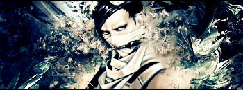
    I've never been a huge fan of pop-outs. However that shouldnt change your opinion or style at all.
    The sig itself seems a bit monotone. Try and add more colors too it. The toxic looking effect is okay, but i need something else.
    The text. Stick to default fonts, I'm telling you they will blend with the sig WAY better than any downloadable font.
    I recommend you read Darkmethod's guideline's on text in the tutorial section. It'll help you a lot.

    Blending is looking pretty nice however you could use some more blending on the right of the sig.

    BG's looking okay too, nice job just gotta do some minor tweeks.


    My DevART
    RATCHET is my bitch
    Andrew says:
    u ever stolen a bible?
    Apathy says:
    no
    used the last two pages to roll a joint though
    Andrew says:
    wow
    thats fucking hard core
    ^^HAHAHA, dm sucks XD


  6. #6
    Join Date
    Mar 2008
    Location
    Belgrade, Serbia
    Posts
    54

    Default

    Thnx 4 comments and suggestions ... never been good in text ... i will check tuts here thnx ...

  7. #7
    Join Date
    Mar 2008
    Location
    Denmark
    Posts
    204

    Default

    Good job... not so many pop out sig's

    SOTW Entry:

    ZOMG?!


  8. #8
    Join Date
    Mar 2007
    Location
    Oslo, Norway
    Posts
    1,509

    Default

    maybe try remove the edges on the pop out part of the sig. would look way better.
    but good job on this agree with papa

    Formerly known as silentshadow
    http://flickr.com/aeilertsen

  9. #9
    Join Date
    Jul 2007
    Posts
    1,098

    Default

    yea, it would look better if you erased all the smudging(?) that leaks out past the border.


  10. #10
    Join Date
    Mar 2008
    Location
    Belgrade, Serbia
    Posts
    54

    Default

    I always had a thought that if leaks out looks better

Similar Threads

  1. samurai
    By ArJ25 in forum Sigs & Manips
    Replies: 5
    Last Post: 11-17-2007, 04:17 AM
  2. Samurai
    By +mw.kira in forum Sigs & Manips
    Replies: 4
    Last Post: 09-10-2007, 02:58 AM
  3. Samurai
    By Shadowz in forum Sigs & Manips
    Replies: 4
    Last Post: 04-30-2007, 01:49 PM
  4. Samurai
    By Lord_badass in forum Sigs & Manips
    Replies: 4
    Last Post: 11-19-2005, 05:32 PM
  5. samurai
    By *Peng* in forum Digital Art
    Replies: 3
    Last Post: 09-22-2005, 09:30 AM

Posting Permissions

  • You may not post new threads
  • You may not post replies
  • You may not post attachments
  • You may not edit your posts
  •  
Powered by vBadvanced CMPS v4.1.1