


I'm back now ;]
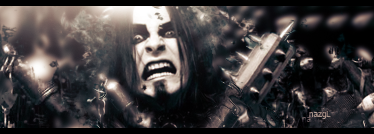
plain
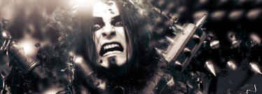
w/ border+text
EDIT:Text fix(opacity)
EDIT2:Text Fix 2
EDIT3:Clipping mask, bottom right :/
|
|


Loading...
|
» Online Users: 7,706
|
Results 1 to 9 of 9
Thread: Shagrath
Similar Threads
|


 Reply With Quote


 although i hate Dimmu Borgir:P


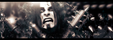
 nice sig ... last one looks best

 ::new::
 ::fav::


