GFXVoid Graphic Design Forum

Remove Text Formatting
Loading...

» Online Users: 4,060

0 members and 4,060 guests
No Members online

» Site Navigation

 > FAQ

» Stats

Members: 35,443
Threads: 103,072
Posts: 826,684
Top Poster: cc.RadillacVIII (7,429)
Welcome to our newest member, Lekelindids
Results 1 to 3 of 3

Thread: Dr. House

  1. #1

    Default Dr. House

    um sig i made critize it plze ._.


  2. #2
    Join Date
    Dec 2006
    Posts
    702

    Default

    Don't like the border so much, but pretty good otherwise .D

    -konfusion

  3. #3
    Join Date
    Feb 2008
    Posts
    8

    Default

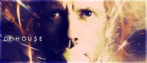
    Very Monotone, add some more color to it.
    Also its very low contrast, brighten it up with some contrast layers,
    Im not a big fan of the font and setting of the text, Maybe try something new?
    The bg needs some more work to it, try adding something with more flow with the FG and render.
    i think its still in the early stages if you work on it some more it will get there
    This is in MOO(My own Opinion), other people have there opinions and i have mine. so dont take it personal.

Similar Threads

  1. a house
    By robgasm in forum Digital Art
    Replies: 4
    Last Post: 02-23-2008, 04:00 PM
  2. .Name ih da house!
    By .Name in forum Introductions
    Replies: 4
    Last Post: 09-23-2007, 08:34 AM
  3. Im in the house.....
    By Samuel in forum Introductions
    Replies: 5
    Last Post: 10-24-2006, 08:07 PM
  4. House Sig
    By felicia07 in forum Sigs & Manips
    Replies: 2
    Last Post: 09-12-2006, 09:17 PM
  5. My House
    By tacoX in forum Digital Art
    Replies: 21
    Last Post: 05-01-2005, 07:59 PM

Posting Permissions

  • You may not post new threads
  • You may not post replies
  • You may not post attachments
  • You may not edit your posts
  •  
Powered by vBadvanced CMPS v4.1.1