0 members and 8,250 guests
No Members online

» Site Navigation

» Stats

Members: 35,443
Threads: 103,072
Posts: 826,684
Top Poster: cc.RadillacVIII (7,429)
|
-
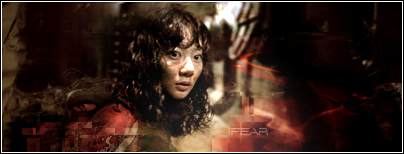
 Fear Fear
One of my best I think.
Without border:

With border:

-

her face looks like its a little messy but it looks good i like w border
-

 Originally Posted by roarnation

her face looks like its a little messy but it looks good i like w border
yea, that's pretty much just the stock.
-

The face, I believe, is supposed to be a little messy, and it adds to the drama, anyways. On the topic of the border, however, you can barely tell them apart, to be perfectly honest. In desperate circumstances (i.e. when the paremeter of the sig is black/dark, you can always expand the border on each side to help emphasize it.
Example:

- Aepos
P.S. You can use the image I edited instead of re-editing it.
Sorry for ripping, GFXVoid Community. It won't happen again.
[Sig under construction...]
-

Aepos though your posts are nice , and your CNC is wonderful and tells people what to do, Here at the void we are supposed to ask people before we can touch their work. And if they want they can even kindly say no, however you have to ask before doing it.
Edit ---- P.S> I don't think the sandwhich border looks very good on this one. They kind of went out of style awhile ago, and tend not to work well with many sigs. IMO.
Definetly your best studhorse! The text is spot on nice job! you really are showing a lot of improvement. the BG is cool and blends well with the stock/render.
As far as borders go i like V2 the best. EVen if it isn't that easy to see it still looks nice to me, besides even if people don't see it, you dont need a border on everything you make. So IMO the black is perfectly fine.
You should current this. Very nice job.
INfact i think you should make a tut on it, a lot of people could learn from this.
 My DevART
RATCHET is my bitch
Andrew says:
u ever stolen a bible?
Apathy says:
no
used the last two pages to roll a joint though
Andrew says:
wow
thats fucking hard core
^^HAHAHA, dm sucks XD
-

Woot!

Thanks guys.
Similar Threads
-
By konfusion in forum Sigs & Manips
Replies: 9
Last Post: 04-05-2007, 06:46 AM
-
By VoodooGypsy in forum Sigs & Manips
Replies: 5
Last Post: 04-02-2007, 01:23 PM
-
By Rorin in forum Digital Art
Replies: 2
Last Post: 10-23-2006, 10:46 PM
-
By Krimsyn in forum Sigs & Manips
Replies: 1
Last Post: 08-27-2005, 11:32 AM
-
By Chemical in forum Sigs & Manips
Replies: 6
Last Post: 08-10-2005, 06:40 PM
 Posting Permissions
- You may not post new threads
- You may not post replies
- You may not post attachments
- You may not edit your posts
-
Forum Rules
|


