GFXVoid Graphic Design Forum

Remove Text Formatting
Loading...

» Online Users: 3,219

0 members and 3,219 guests
No Members online

» Site Navigation

 > FAQ

» Stats

Members: 35,443
Threads: 103,072
Posts: 826,684
Top Poster: cc.RadillacVIII (7,429)
Welcome to our newest member, Lekelindids
Results 1 to 3 of 3

Thread: 2 new sigs

  1. #1
    Join Date
    Apr 2008
    Posts
    12

    Question 2 new sigs

    Constructive Criticism please


  2. #2
    Join Date
    Apr 2008
    Posts
    19

    Default

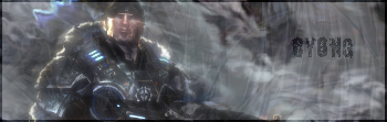
    The render on the 1st one should be over , it all goes together and my eyes dont attract to anything right off the bat,


    The text on both are rather kinda hard to read and actually take a tad bit of finding to see

    What I do with most my sig's is put the render's and it's layers over everything to make it stand out more and make it a bit more brighter so it can be see faster.

  3. #3
    Join Date
    Jul 2007
    Location
    Lithuania
    Posts
    3,611

    Default

    you need to erase things around the render in 1st sig.
    text needs work too.
    in the 2nd one I dont like the text too...


Posting Permissions

  • You may not post new threads
  • You may not post replies
  • You may not post attachments
  • You may not edit your posts
  •  
Powered by vBadvanced CMPS v4.1.1