GFXVoid Graphic Design Forum

Remove Text Formatting
Loading...

» Online Users: 3,911

0 members and 3,911 guests
No Members online

» Site Navigation

 > FAQ

» Stats

Members: 35,443
Threads: 103,072
Posts: 826,684
Top Poster: cc.RadillacVIII (7,429)
Welcome to our newest member, Lekelindids
Results 1 to 5 of 5
  1. #1

    Default new one for the battle

    any advice


  2. #2
    Join Date
    Jul 2007
    Posts
    1,098

    Default

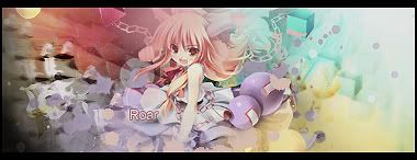
    Well, you've got a lot of colors there.
    Blending looks good, but I'd lose that yellow 1/2 circle in the upper left.
    Text could use some work too.
    Also, maybe a white border, or even no border at all. Not sure if the black goes here.


  3. #3
    Join Date
    Oct 2007
    Posts
    2,782

    Default

    Nice colours roar. I really like this one. Maybe a tut?


  4. #4
    Join Date
    Apr 2008
    Posts
    41

    Default

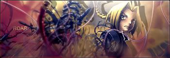
    It's quite good, I don't like the text placement though. Should be somewhere middle right side.GJ

  5. #5
    Join Date
    Mar 2008
    Location
    Hungary
    Posts
    101

    Default

    It's quite good, but i think the text needs some work.
    Don't ask me what you should do, i'm always in trouble with the text

    GJ


Similar Threads

  1. Pro Battle
    By Dick in forum Battlegrounds
    Replies: 45
    Last Post: 08-25-2005, 04:10 PM
  2. RTS Battle
    By Shamino in forum Battlegrounds
    Replies: 6
    Last Post: 07-23-2005, 04:35 PM
  3. battle me!!!
    By gugge in forum Battlegrounds
    Replies: 4
    Last Post: 07-21-2005, 08:30 AM
  4. My Battle Sig
    By Fallen in forum Sigs & Manips
    Replies: 3
    Last Post: 07-17-2005, 10:53 AM
  5. PRO BATTLE
    By DesiTitan in forum Battlegrounds
    Replies: 66
    Last Post: 07-01-2005, 03:41 PM

Posting Permissions

  • You may not post new threads
  • You may not post replies
  • You may not post attachments
  • You may not edit your posts
  •  
Powered by vBadvanced CMPS v4.1.1