0 members and 2,056 guests
No Members online

» Site Navigation

» Stats

Members: 35,443
Threads: 103,072
Posts: 826,684
Top Poster: cc.RadillacVIII (7,429)
|
-
 My Showcase Sigs My Showcase Sigs
-

Wrong section :P
I'll just move this to the signature and avatars area.
 My DevART
RATCHET is my bitch
Andrew says:
u ever stolen a bible?
Apathy says:
no
used the last two pages to roll a joint though
Andrew says:
wow
thats fucking hard core
^^HAHAHA, dm sucks XD
-
-


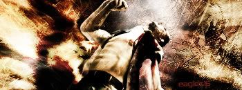
Ok, let's see... the first sig has a direction to it, and I like it. But I think it could've been executed better. You typically don't want to put your focal point at the center of a sig, but that's really just personal preference because it's just a sig (you'll learn about placement in art class if you hadn't taken any yet). I'm not really too fond of the double visioning going there. It would also be good if you lessen the contrast shifts in the background and/or blur the background so not to make it as sharp as the foreground (the focal point). The eagles color can be a bit brighter for readability. Otherwise, it's a good sig 

A simple rule that you should follow is to always try to avoid "clipping." Kratos would appreciate if you kept the top 10% of the head within the sig! Try to avoid the glowing you did on the left side. The text and the white soft brushing detracts us from the focal point (Kratos) which is also very close to it. Now you can understand Kratos' anger -- they don't want to share spaces! The sig is good, and would be better if you would fix those problems.

Hmm, I'm not good at rating these types of sigs. I like my backgrounds to be solid, and yours looks like paper and fabric overlay which would make some sense in this context. You provided some balance in the sig by placing a paper-like strand on the left which complements the ninja's umm... scarf thing to the right.

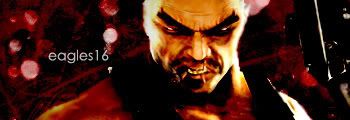
This one's your best out of your showcase. The other sigs of its type are too soft on the edges, loose in coloring and style (except for the B&W one). When your character has highlights as bright as he does, don't mess with it! It looks as if you changed the transparency of Heihachi on two of them. This just makes the image look very flat and murky. The one I quoted is the best out of the bunch. The highlights are just as they should be, and I actually like the gritty blood red and black look. Nice job! 

Good to see you didn't place Adrian in the center of the sig. The background looks flat and uninteresting. The casting on the right side isn't cutting it for me. Sports renders are one of the renders that I feel should have a background that deals with the sports. The background is flat and uninteresting. The Heihachi one is definitely the best.
Keep it up! I'll have to show you some of my first sigs, it's horrible lol.
Last edited by Psypher; 04-26-2008 at 08:32 PM.
-

thanks for the CNC  yeah the double image on the first one did kind of bother me, thanks for the reviews they really help, i'll keep all of this in mind yeah the double image on the first one did kind of bother me, thanks for the reviews they really help, i'll keep all of this in mind 
Similar Threads
-
By ~>MF29<~ in forum Sigs & Manips
Replies: 7
Last Post: 05-29-2008, 12:55 PM
-
By AntidotexXx in forum Sigs & Manips
Replies: 7
Last Post: 11-15-2006, 12:55 PM
 Posting Permissions
- You may not post new threads
- You may not post replies
- You may not post attachments
- You may not edit your posts
-
Forum Rules
|


