0 members and 3,104 guests
No Members online

» Site Navigation

» Stats

Members: 35,443
Threads: 103,072
Posts: 826,684
Top Poster: cc.RadillacVIII (7,429)
|
-
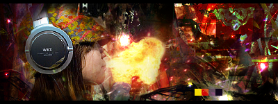
 Jessica alba Jessica alba

comment please
-

sweet write a tut..nice effects nd depth
-

oh wow my first tutorial request,i'll do my best  
-

Wow.. That's a nice one..  The only thing that could be better IMO is the text.. Can't give you any advice about it though since I suck at it.. The only thing that could be better IMO is the text.. Can't give you any advice about it though since I suck at it..  Other than that, that's a wowee of a sig.. Other than that, that's a wowee of a sig.. 
-
-

Great effects, but did you cut her out of a stock and try to blend her or is that a render?
I don't think she's blended in with the rest of the sig very well.
Text needs work too, other than that though,nice job.
-

Her hair is looking pretty nasty, if it was blended bette and not so obvious that it was her hair than it would be okay, but it's pretty, bad looking, other than that, you should write a tutorial.

"Judge a man by his questions,
not his answers."
-Voltaire
-

The blending from the hair to the BG could use a lot of work. The flat out blur/smudge thing just isn't working. IMO, maybe try a few clipping masks or some smudging.
The BG is okay but it just seems like a bit of an overload on c4d's to me. Maybe it's not rly that that bothers me (though that is a contributing factor). The main thing that i guess bothers me about the BG is that it goes from bright yellow/white on the left and then fades into gray/black. It does this way too quickly and there is hardly any transition. Because of this I'm really...unsure of the BG.
I would try to improve your transition, and this can easily be done with clipping masks, however if you want to go with smudging that would work fine as well, hell a well place c4d might even work here.
The text needs some help. I would stick to default fonts, kind of like arial, eurose, tahoma, veranda. ANything easy to read.
Remember your text IS A PART OF YOUR SIG so putting it off to teh side like that makes me think you aren't confident in your abality to do text (which isn't so, because you aren't off to a bad start  ) )
I would suggest moving your text. More towards the center and a bit towards the right by about 10 - 15 px. I would also change the color to a yellow red or something. Finally the text on the little vertical bar IMO should be gone, however if you want to keep it i think the best place to put it would be underneath the other text after you move it...
Know what i mean? :P
The black bar separating the clipping mask and the sig is kind of distracting. I dont see a point in having it, and i think overall if it were just the clipping mask without the bar it would be more..unifying the sig.
The coloring on this sig is great. I love the red/orange choice, it really makes the goldish hue of alba pop. Alos the effects are prooving nicely. Nice job.
I hope you understand what i mean :P, don't take what i say harsh either, no matter how much anyone disects the sig it's still really good.
Nice job!
 My DevART
RATCHET is my bitch
Andrew says:
u ever stolen a bible?
Apathy says:
no
used the last two pages to roll a joint though
Andrew says:
wow
thats fucking hard core
^^HAHAHA, dm sucks XD
-

Thanks,and don't worry i understood it.And i'll work on my text lol everyone says it sucks  .And don't worry no offense taken.Whole point of posting the signature to know what needs to get better .And don't worry no offense taken.Whole point of posting the signature to know what needs to get better
Similar Threads
-
By Sp!t in forum Sigs & Manips
Replies: 4
Last Post: 09-03-2007, 06:06 AM
-
By LoganGFX in forum Sigs & Manips
Replies: 5
Last Post: 03-31-2007, 10:12 AM
-
By Dark Method in forum Sigs & Manips
Replies: 24
Last Post: 02-17-2007, 04:01 PM
-
By blindman4556 in forum Sigs & Manips
Replies: 1
Last Post: 01-07-2007, 01:01 PM
-
By Dark Method in forum Sigs & Manips
Replies: 3
Last Post: 12-21-2006, 10:16 AM
 Posting Permissions
- You may not post new threads
- You may not post replies
- You may not post attachments
- You may not edit your posts
-
Forum Rules
|

