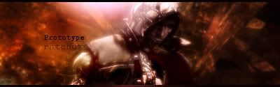
Think lighting is a little strong and the front of the render is almost completely black, so maybe a little less contrast. More of a showed face llok as opposed to nearly black.
Nice BG too.
Maybe some sharpening too on the render.
Think lighting is a little strong and the front of the render is almost completely black, so maybe a little less contrast. More of a showed face llok as opposed to nearly black.
Nice BG too.
Maybe some sharpening too on the render.
Thanks for that.
V2
Last edited by ratchetnclank; 05-02-2008 at 09:21 AM.


 Reply With Quote