GFXVoid Graphic Design Forum

Remove Text Formatting
Loading...

» Online Users: 3,912

0 members and 3,912 guests
No Members online

» Site Navigation

 > FAQ

» Stats

Members: 35,443
Threads: 103,072
Posts: 826,684
Top Poster: cc.RadillacVIII (7,429)
Welcome to our newest member, Lekelindids
Results 1 to 8 of 8

Thread: some new sigs

  1. #1
    Join Date
    Mar 2008
    Location
    Mexico
    Posts
    391

    Default some new sigs

    so i got this results over the days and well u know not to good but still wanted to see waht u guys think please rate and comment =P

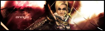
    this is for a friend who plays FFXI


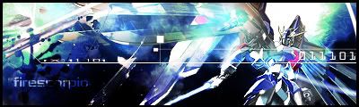
    the gundam si somewhere in there xD
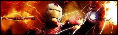

    irnoman thingy


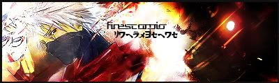
    kakashi sig kinda digging this one =P


    and um yeah havent finished this one dunno w/e rlly =P

  2. #2
    Join Date
    May 2008
    Location
    Anchorage, AK
    Posts
    440

    Default

    First one looks good, like the background; possibly try to blend a lil more maybe. The gundam wing one (love the very first series) is cool, cant really see the focal point though. Besides that, awesome work.
    Fav:

    M-Birds = Godly

  3. #3
    Join Date
    May 2008
    Location
    Everywhere
    Posts
    51

    Default

    you have some really good concept and ideas. You definitely have the general basics down but... (theres always a but ) in the ironman sig the pen near his hands arent really that swell. Try making them come OUT from the glowing orb. The Gundam Seed one is too chaotic my eyes dont focus on anything. That means you have to have a focal point. I like the effects on the last one... The first one is too simple and the colours dont go well with the render... the second last one is alright but you need to make the right side more interesting. Chinese writing needs to be smaller and more subtle than your name. Otherwise i like them and i like the ideas you come up with (im no bucket of ideas myself)
    It only matters how good it looks not all the operations used to get it.
    Most Recent:


  4. #4
    Join Date
    May 2008
    Location
    Anchorage, AK
    Posts
    440

    Default

    A pretty cool effect, not sure if anyone uses it; but I like it. Is you make a black square around ironmans hand, where the energy or whatever is coming out, and do a lens flare; and kinda take a soft brush and lightly erase around the bulbish thing in his hand. Kinda like on my sig where I have the engines blasting. IDK personal like to an effect to make it look like somethings happening. :P
    Fav:

    M-Birds = Godly

  5. #5
    Join Date
    Mar 2008
    Location
    Mexico
    Posts
    391

    Default

    thnx guys and yeah i do use the effect of the lens flare actually allot lol and yeah the gundam sig i do agree its pretty much a train wreck lol it was jsut a really go licking and moving thing... till i got tired lolz XD thank you guys btw zeveener i love your planet sig looks awsoome

  6. #6
    Join Date
    May 2008
    Location
    Everywhere
    Posts
    51

    Default

    ive never heard of that ill be sure to try it in another signature that i make
    It only matters how good it looks not all the operations used to get it.
    Most Recent:


  7. #7
    Join Date
    May 2008
    Location
    Anchorage, AK
    Posts
    440

    Default

    Yea I didnt see it on a tutorial and actually I think the first sig I used it on was my extinction, then I did it on my recent one; under his hands and turned out pretty nicely, cause the render originally had his hands have light coming from underneath, so I thought I would see how it worked out. And np fire, keep em coming
    Fav:

    M-Birds = Godly

  8. #8
    Join Date
    May 2008
    Location
    Anchorage, AK
    Posts
    440

    Default

    Heres my quick 5 min attempt at a gundamn sig :P


    Didnt even bother putting my name on it lol
    Fav:

    M-Birds = Godly

Posting Permissions

  • You may not post new threads
  • You may not post replies
  • You may not post attachments
  • You may not edit your posts
  •  
Powered by vBadvanced CMPS v4.1.1