GFXVoid Graphic Design Forum

Remove Text Formatting
Loading...

» Online Users: 7,347

0 members and 7,347 guests
No Members online

» Site Navigation

 > FAQ

» Stats

Members: 35,443
Threads: 103,072
Posts: 826,684
Top Poster: cc.RadillacVIII (7,429)
Welcome to our newest member, Lekelindids
Results 1 to 3 of 3

Thread: the joker

  1. #1
    Join Date
    Mar 2008
    Location
    Mexico
    Posts
    391

    Default the joker

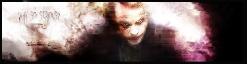
    so i tried this kidna worked on it more than usual but i think i overworked it i wanted the joker to look even more evil xD than he already looks please comment and rate =P tried using no brushes this time


  2. #2
    Join Date
    May 2008
    Location
    Anchorage, AK
    Posts
    440

    Default

    I think the white makes him not so evil, and seems to be... over-blended? Thats just what it looks like to me though. Good start.
    Fav:

    M-Birds = Godly

  3. #3
    Join Date
    Feb 2008
    Location
    Toronto, Canada
    Posts
    4,831

    Default

    i can't see him much..but i like your attempt...


Similar Threads

  1. the joker
    By RONIN in forum Sigs & Manips
    Replies: 6
    Last Post: 11-10-2007, 12:03 PM
  2. Joker / Drany
    By .Moon.Man. in forum Sigs & Manips
    Replies: 2
    Last Post: 10-17-2007, 06:15 PM
  3. Joker
    By nazz in forum Sigs & Manips
    Replies: 6
    Last Post: 08-04-2007, 04:28 PM
  4. Joker
    By eLLuSioNiST in forum Sigs & Manips
    Replies: 5
    Last Post: 02-01-2005, 08:39 PM

Posting Permissions

  • You may not post new threads
  • You may not post replies
  • You may not post attachments
  • You may not edit your posts
  •  
Powered by vBadvanced CMPS v4.1.1