0 members and 6,656 guests
No Members online

» Site Navigation

» Stats
Members: 35,443
Threads: 103,072
Posts: 826,684
Top Poster: cc.RadillacVIII (7,429)
|
-
 Spiderman Spiderman
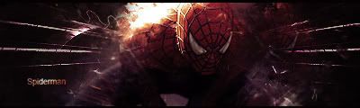
Really please with this one.
Cnc Please.
-
The direct opposite of your mario sig. This is a bit dark.
But other tha that very nice IMO
nice simplicity, but it still looks kind of rough
gj^^
-
one of your better ones IMO
great composition...nice effects..
just a bit dark..
but very good
-
Thanks guys. I think my monitors settings are set quite bright so it looks less dark. I'll have to bear it in mind for my next one. Thanks for the feedback though, i really apprieciate it
-
THis baby looks pretty dark. I can hardly see his face.
The blending is nice and the explosion(damn cool) that you put behind him serves as a perfect lightsource.
The bg is alright though i think you should lighten it a bit.
The text..This is your falling point. I would try to stray away from clipping masks. They make it really hard to make it either appear, or blend. One part will be unreadably dark and the other will be BRIGHT :P. SO i say get rid of the mask and jst leave it regular text.
Brighten up the sig about though okay?
 My DevART
RATCHET is my bitch
Andrew says:
u ever stolen a bible?
Apathy says:
no
used the last two pages to roll a joint though
Andrew says:
wow
thats fucking hard core
^^HAHAHA, dm sucks XD
-
Explosion looks sweet, just brighten the render and fix the text and I would say, awesome... Though I am still saying awesome sig.
-
 Originally Posted by Papa

THis baby looks pretty dark. I can hardly see his face.
The blending is nice and the explosion(damn cool) that you put behind him serves as a perfect lightsource.
The bg is alright though i think you should lighten it a bit.
The text..This is your falling point. I would try to stray away from clipping masks. They make it really hard to make it either appear, or blend. One part will be unreadably dark and the other will be BRIGHT :P. SO i say get rid of the mask and jst leave it regular text.
Brighten up the sig about though okay?
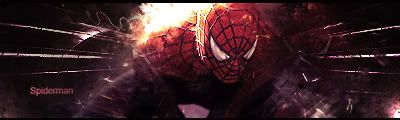
V2
Better?
-
Much better, maybe blur the spike things on the sides to give it a lil depth?
Similar Threads
-
By Craka in forum Sigs & Manips
Replies: 8
Last Post: 07-24-2007, 08:45 PM
-
By konfusion in forum Sigs & Manips
Replies: 5
Last Post: 04-08-2007, 06:08 AM
-
By OpticoN in forum Sigs & Manips
Replies: 5
Last Post: 10-22-2005, 08:59 PM
-
By Tyson in forum Sigs & Manips
Replies: 5
Last Post: 09-27-2005, 09:47 AM
-
By jerner in forum Digital Art
Replies: 3
Last Post: 09-19-2005, 07:57 AM
 Posting Permissions
- You may not post new threads
- You may not post replies
- You may not post attachments
- You may not edit your posts
-
Forum Rules
|


 Reply With Quote


