GFXVoid Graphic Design Forum

Remove Text Formatting
Loading...

» Online Users: 5,637

0 members and 5,637 guests
No Members online

» Site Navigation

 > FAQ

» Stats

Members: 35,443
Threads: 103,072
Posts: 826,684
Top Poster: cc.RadillacVIII (7,429)
Welcome to our newest member, Lekelindids
Results 1 to 4 of 4
  1. #1
    Join Date
    May 2008
    Posts
    104

    Default Mario Sigggggggg

    (v1)

    (v2)

  2. #2
    Join Date
    Oct 2007
    Posts
    2,782

    Default

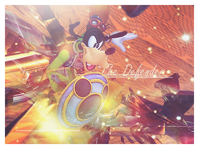
    The lighting is better on this yet there is no defined source of light. The c4d's need blending via smudge or masks. The text needs work too. Try and sort out the background and the lighting and it will look 10 times better.


  3. #3
    Join Date
    Feb 2008
    Location
    Toronto, Canada
    Posts
    4,831

    Default

    render seems stretched out to me?

    lol three different sigs with same render in a row:P


  4. #4
    Join Date
    May 2008
    Location
    vagina
    Posts
    90

    Default

    I like the second one better, but I don't like the outer glow on the text.
    Newest:


    Favorite:


Similar Threads

  1. Mario :P
    By ratchetnclank in forum Sigs & Manips
    Replies: 8
    Last Post: 05-26-2008, 06:23 AM
  2. mario!- HDS
    By hds272 in forum Sigs & Manips
    Replies: 2
    Last Post: 08-11-2007, 10:35 PM
  3. Mario!
    By Pwny in forum Sigs & Manips
    Replies: 4
    Last Post: 04-16-2007, 08:29 PM
  4. its a me, mariO
    By Zeyne in forum Sigs & Manips
    Replies: 6
    Last Post: 11-22-2005, 10:15 PM
  5. Mario
    By Freak in forum Sigs & Manips
    Replies: 4
    Last Post: 11-04-2005, 08:51 AM

Posting Permissions

  • You may not post new threads
  • You may not post replies
  • You may not post attachments
  • You may not edit your posts
  •  
Powered by vBadvanced CMPS v4.1.1