0 members and 1,493 guests
No Members online

» Site Navigation

» Stats
Members: 35,443
Threads: 103,072
Posts: 826,684
Top Poster: cc.RadillacVIII (7,429)
|
-
 Acension Acension
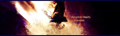
Cnc would be much appreciated 
-
I cant understand that the render is.
also the colors are too strong, too bright.
lower the opacity on text.
some BG are too empty. only black.
-
The render is sora from kingdom hearts. The colours were intentionally strong as was the empty space. I'll sort out the text though. Thanks garis.
-
I like the flow and depth, but the text is bad. Imo its good, but I'm still kind of new at this.
-
usually i dont like overcontrasted sigs..but this is really working...
i think you should current it.. i like it alot
-
 Originally Posted by Immortal.

usually i dont like overcontrasted sigs..but this is really working...
i think you should current it.. i like it alot
Thanks immortal 
-
Originally Posted by Vel
I like the flow and depth, but the text is bad. Imo its good, but I'm still kind of new at this.
it's great your critiquing, especially since your new. However I think you should tell him HOW to fix what is bad, rather than just saying it's bad. Even if you don't really know then say it, I don't know. But the best way to learn is to teach, and so i think you should give him example on how he could fix his text and such.
Sry ratchet I'l critique this later, i don't have time for a long 10-15 minute critique, and i don't want to short change ya, so I'm just gonna leave this until a bit later.
 My DevART
RATCHET is my bitch
Andrew says:
u ever stolen a bible?
Apathy says:
no
used the last two pages to roll a joint though
Andrew says:
wow
thats fucking hard core
^^HAHAHA, dm sucks XD
-
-
Hmm....Text....If it was me...i've have it a different color...and 2 different fonts. one slightly bigger than the other. and one slightly more visible than the other. Like in my Prince of persia one for example. "awaken the beast" is kinda hidden, but it's still there and readable. should try this as well..
Kingdom Hearts
Acersion
Or something along that line. or seperate it all togehter. opposite sides of the character. Theres so much stuff you can do with the text man. i see waht your going for though. other than the text i wouldn't change a thing. i love the colors, the character, your positioning and the effects. very nice sig, just tweak ur text a little bit, it's a little too powerful IMO. It's up to you, just some ideas im throwin out there. Lol.
-
Damn it totally went to the left, instead of how i plotted it out lol
 Posting Permissions
- You may not post new threads
- You may not post replies
- You may not post attachments
- You may not edit your posts
-
Forum Rules
|


 Reply With Quote