GFXVoid Graphic Design Forum

Remove Text Formatting
Loading...

» Online Users: 1,773

0 members and 1,773 guests
No Members online

» Site Navigation

 > FAQ

» Stats

Members: 35,443
Threads: 103,072
Posts: 826,684
Top Poster: cc.RadillacVIII (7,429)
Welcome to our newest member, Lekelindids
Results 1 to 5 of 5

Thread: God of War

  1. #1
    Join Date
    Jul 2007
    Posts
    1,098

    Default God of War

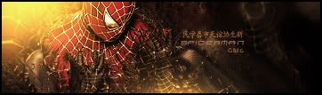
    Well, haven't done one in a little while, so here it is.
    It started out as something else, didn't work, so I had to cover it up with another render :/
    It has a feel of artists like Frank Frazetta (kinda like Death Dealerish).


  2. #2
    Join Date
    Oct 2007
    Posts
    2,782

    Default

    I like the blending and text, could do with a few more effects.The render seems a bit too bright for the rest of the sig.

    Tone it down via a curves layer


  3. #3

    Default

    Yea nice sig. It could do for a curves layer like said, that should fix it up right nice =D. i don't think it needs more effects i like it how it is. =).


  4. #4
    Join Date
    May 2006
    Location
    Canada
    Posts
    556

    Default

    i love it the way it is. gj ;D


  5. #5
    Join Date
    Feb 2008
    Location
    Toronto, Canada
    Posts
    4,831

    Default

    i really like the effect by the right side of kratos..
    but it is a bit dark...great sig man


Posting Permissions

  • You may not post new threads
  • You may not post replies
  • You may not post attachments
  • You may not edit your posts
  •  
Powered by vBadvanced CMPS v4.1.1