0 members and 2,239 guests
No Members online

» Site Navigation

» Stats
Members: 35,443
Threads: 103,072
Posts: 826,684
Top Poster: cc.RadillacVIII (7,429)
|
-
 new sig yay! > < new sig yay! > <
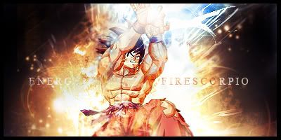
sooo ive been workin some and learning some more and tried some diffretn thigns than i usually do and a different sig size idk quite happy with the result still CnC please =) think text too big might fix it but here goes
newest:

Fav :

The true and only Firescorpio!
(no autographs please)
-
I would say put the Energy text on where you name is and then put ur name below the Energy text but make it smaller, other than that; nice sig, awesome lighting, blending, some nice effects, and still love the text; gotta tell me where you got it from :P
-
-
lol actually as a last term proyect at school we had to remake a movie poser/campaign and well i chose riddick so i go the idea from the part were vin diesels name is displayed the separation and all
lol
newest:
Fav :
The true and only Firescorpio!
(no autographs please)
-
 Originally Posted by SpYdaBoi

good job
Why is it good? Help him out a bit spyder i know you can do a bit better than that.
I personally think this is one of your best yet! The effects are spot on your really nailed it this time. The render i think needs to be cleared up a bit there are lines all over it that don't rly help the sig, and make the render unclear.
The blending is okay especially on the left side, but i think you could use a bit more like on the right side of him, especially his leg thats stickin out. It doesn't blend a lot and could use some help.
The text is pretty good but i think you needa move it under each other like said before. Having is spread out like that is not working dynamics wise. I think you should also make it a bit smaller. But overall its pretty good.
The coloring is spot on the top is essentail! it'd be too mono without it so nice job.
I think the BG is a bit blown out. It's really really white, especially when there isn't that much contrast in the light on the render, it's pretty soft. I'd tone it down a bit but it's not bad.
However i got bad news. The lighting direction is off. if you check under his armpit you can see there is significant shadows, showing the light is coming from the right, not behind.
You could even get away with it if the light wasn't aimed more towards the right but it is, and so if you get rid of it on the right, i think it'll be fine.
Again though great job on effects, coloring and border. Just gotta work a bit on the rest.
 My DevART
RATCHET is my bitch
Andrew says:
u ever stolen a bible?
Apathy says:
no
used the last two pages to roll a joint though
Andrew says:
wow
thats fucking hard core
^^HAHAHA, dm sucks XD
-
as papa mentioned..the lighting is good
and everything else
the only thing bothering me is the text....ur placement is well done
yet i cant read it
if it were me. i'd overlay it on a small font..
but thats' MO
-
yeah i wasn't that happy with the text after all workin on it later on but thnz for the comments your guys 8Q =P
newest:
Fav :
The true and only Firescorpio!
(no autographs please)
 Posting Permissions
- You may not post new threads
- You may not post replies
- You may not post attachments
- You may not edit your posts
-
Forum Rules
|


 Reply With Quote


