0 members and 5,548 guests
No Members online

» Site Navigation

» Stats
Members: 35,443
Threads: 103,072
Posts: 826,684
Top Poster: cc.RadillacVIII (7,429)
|
-
 Samus Samus
Eh?
-
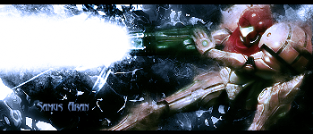
The render colours dont seem to fit with the background colours. Also try sharpening the render. Good blending and smudging though.
-
 Originally Posted by ratchetnclank

The render colours dont seem to fit with the background colours. Also try sharpening the render. Good blending and smudging though.
Stole the words out of my mouth. Usually blue doesn't go so well with red/orange. Well actually blue goes pretty well with orange. but i wouldn't suggest the Samus color of orange. thats kinda red.
Nice job on the smudging though, it looks pretty sweet.
 My DevART
RATCHET is my bitch
Andrew says:
u ever stolen a bible?
Apathy says:
no
used the last two pages to roll a joint though
Andrew says:
wow
thats fucking hard core
^^HAHAHA, dm sucks XD
-
as they both said the bg colors seem to cotnrast too much with the render also good smudging also blur the bg to creat more depth on the sig coudl do it as well as ratchet said sharpening the render
newest:

Fav :

The true and only Firescorpio!
(no autographs please)
-
i dont like it that much it needs more work imo
-
Spyder please tell him how to fix it. Just saying:
Originally Posted by SpYdaBoi
i dont like it that much it needs more work imo
Does not help the artist, and is borderline bashing. Please TRY to CnC or don't do it at all. I'd be more lenient if this wasn't a reoccurring problem.
I know you don't really know you are doing it, but just try to remember and do your best in the future.
Last edited by Papa; 06-09-2008 at 07:30 PM.
My DevART
RATCHET is my bitch
Andrew says:
u ever stolen a bible?
Apathy says:
no
used the last two pages to roll a joint though
Andrew says:
wow
thats fucking hard core
^^HAHAHA, dm sucks XD
-
im sorry i wasent trying to be an ass im just saying that rachet can do way better work than that thats all
-
Originally Posted by SpYdaBoi
im sorry i wasent trying to be an ass im just saying that rachet can do way better work than that thats all
it's alright, just try to work on giving a sentence or two on how to fix it.
Btw it isn't ratchet..it's vel.
My DevART
RATCHET is my bitch
Andrew says:
u ever stolen a bible?
Apathy says:
no
used the last two pages to roll a joint though
Andrew says:
wow
thats fucking hard core
^^HAHAHA, dm sucks XD
-
back on topic.....
maybe and blue and orange gradient map on color or hue with 25% opacity could help this sig out also make the text a tag bigger and lower its opacity :]
-
Originally Posted by SpYdaBoi
im sorry i wasent trying to be an ass im just saying that rachet can do way better work than that thats all
What the hell does ratchet have to do with me? Seriously? Unless you have some useful things to say then get the fuck out of this thread.
Anyhow.
Thanks for the comments guys. Yeah I was attempting to go with blue because of the beam but the beam clashes with samus's original colours. Next time I'll try orange or red.
Similar Threads
-
By Drolaw in forum Sigs & Manips
Replies: 8
Last Post: 07-24-2007, 08:47 PM
-
By RONIN in forum Sigs & Manips
Replies: 7
Last Post: 05-01-2007, 08:49 PM
-
By DinoKind in forum Sigs & Manips
Replies: 7
Last Post: 11-13-2005, 10:15 PM
-
By E-Man in forum Digital Art
Replies: 4
Last Post: 09-05-2005, 06:21 PM
-
By ActofBetrayl in forum Sigs & Manips
Replies: 2
Last Post: 05-19-2005, 12:44 AM
 Posting Permissions
- You may not post new threads
- You may not post replies
- You may not post attachments
- You may not edit your posts
-
Forum Rules
|


 Reply With Quote


 ::new::
 ::fav::