0 members and 1,449 guests
No Members online

» Site Navigation

» Stats
Members: 35,443
Threads: 103,072
Posts: 826,684
Top Poster: cc.RadillacVIII (7,429)
|
-
 Constructive Criticism: Constructive Criticism:
-
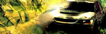
i like the creativity on the text, im not great with car sigs ive made 1 in my life and your is way better then mine. but possibly bring the text about the scan lines or erase the scan lines with a soft brush in some spots to give it more clarity also i think u smudged it a lil to much but looking good man nice colors
-
The Bg on this is rather awkward IMO. Try to stay away from creating your background for solid shapes only. They are great to use, but GFX is about moderation. Solid shapes are great for adding style and your own flair to the BG(background), however use EVERYTHING in moderation.
Also with the scan lines, They use to be VERY popular, however now they are kind of out of style, however that is not to say you shouldn't use them, but don't cover the whole sig with them. Maybe only a part or two.
The blending on this is okay, though it could use some more on the right side. You did make a smart move though, trying to smudge over the Blown out white part of the car. That was very smart, next time try to make it look a bit more natural by moving the smudging into the BG a bit as well.
The coloring on this looks pretty nice. SO you did a very good job on that.
The text is okay, but you want to remember to use a default font, and to keep it small. It's supposed to blend into the sig, not attract that much attention.
I recommend you read this guide to text:
Darkmethod's Guide to Text
Also i think you should read a couple of tutorials they will help you a lot.
I strongly recommend my tutorials (:P), daemon's and ilovecoheeds, but they are all good so go check 'em out.
 My DevART
RATCHET is my bitch
Andrew says:
u ever stolen a bible?
Apathy says:
no
used the last two pages to roll a joint though
Andrew says:
wow
thats fucking hard core
^^HAHAHA, dm sucks XD
-
Ok thanks, and yeah I was actually gonna use the Verdana text but I forgot about it lol.
Oh and what do you mean by the stay away from making the background for solid shapes only?
Last edited by ||.Falcons|Shifty; 06-09-2008 at 06:51 PM.
Similar Threads
-
By ||.Falcons|Shifty in forum Sigs & Manips
Replies: 3
Last Post: 04-06-2008, 12:32 PM
-
By Rhage in forum Sigs & Manips
Replies: 3
Last Post: 10-14-2006, 09:08 AM
-
By Darkness-Consumes in forum Digital Art
Replies: 6
Last Post: 09-16-2006, 03:56 PM
-
By Fort_of_Shadows in forum Digital Art
Replies: 6
Last Post: 01-23-2006, 11:41 AM
-
By -Konnor- in forum Sigs & Manips
Replies: 4
Last Post: 03-15-2005, 01:22 PM
 Posting Permissions
- You may not post new threads
- You may not post replies
- You may not post attachments
- You may not edit your posts
-
Forum Rules
|


 Reply With Quote

 ::new::
 ::fav::

