GFXVoid Graphic Design Forum

Remove Text Formatting
Loading...

» Online Users: 6,280

0 members and 6,280 guests
No Members online

» Site Navigation

 > FAQ

» Stats

Members: 35,443
Threads: 103,072
Posts: 826,684
Top Poster: cc.RadillacVIII (7,429)
Welcome to our newest member, Lekelindids
Results 1 to 10 of 10

Thread: Rage...

  1. #1
    Join Date
    Jan 2008
    Location
    Saratoga Springs, NY
    Posts
    208

    Default Rage...

    Latest

  2. #2
    Join Date
    Feb 2008
    Location
    Toronto, Canada
    Posts
    4,831

    Default

    how is it that u make all ur sig look so damned good?
    love the effects...as well as the colours
    text is pretty well done as well
    top job my friend


  3. #3
    Join Date
    Jul 2007
    Posts
    1,098

    Default

    You're best.
    easily
    Love it man.


  4. #4
    Join Date
    Jan 2008
    Location
    Saratoga Springs, NY
    Posts
    208

    Default

    thanks guys. Happy with result. Just think it is missing something? maybe more depth needed?
    Latest

  5. #5
    Join Date
    May 2008
    Location
    Anchorage, AK
    Posts
    440

    Default

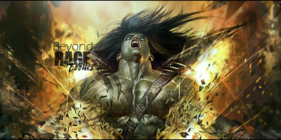
    Actually depth is pretty much spot on, as well as text. Love the effects, maybe blend the arms at the bottom left and right? Not quite sure but fantastic work.
    Fav:

    M-Birds = Godly

  6. #6
    Join Date
    Jul 2007
    Posts
    1,098

    Default

    You Topaz'n Mf'ers
    Gotta get that and check it out.


  7. #7
    Join Date
    Mar 2008
    Location
    Mexico
    Posts
    391

    Default

    lol topaz ftfw xD lawl xD great job love it
    newest:

    Fav :


    The true and only Firescorpio!
    (no autographs please)


  8. #8
    Join Date
    Jan 2007
    Location
    Minnesota
    Posts
    5,091

    Default

    This looks AWESOME. My only critique is that i don't really agree with the lighting. If you look at his face it's actually supposed to be more towards the left side of the sig. But ya know I'm kinda just it-picking for something to critique :P.


    My DevART
    RATCHET is my bitch
    Andrew says:
    u ever stolen a bible?
    Apathy says:
    no
    used the last two pages to roll a joint though
    Andrew says:
    wow
    thats fucking hard core
    ^^HAHAHA, dm sucks XD


  9. #9
    Join Date
    Mar 2007
    Location
    Denmark
    Posts
    4,197

    Default

    looks insane great job i just hate that it is that tall ;p effects are nice and blending aswell great.


  10. #10
    Join Date
    May 2006
    Location
    Canada
    Posts
    556

    Default

    5/5 10/10 2 thumbs up 100% what more can i say


Similar Threads

  1. Inside Rage...
    By Devon in forum Sigs & Manips
    Replies: 4
    Last Post: 11-15-2007, 03:52 PM
  2. rage
    By LoganGFX in forum Sigs & Manips
    Replies: 7
    Last Post: 04-03-2007, 03:43 AM
  3. Rage e-mails
    By Sp0rk-eh in forum The Void
    Replies: 5
    Last Post: 05-23-2005, 07:34 PM
  4. Rage
    By -Kanji- in forum Sigs & Manips
    Replies: 3
    Last Post: 03-21-2005, 11:29 PM
  5. RAGE!!! sign.
    By Morphius in forum Sigs & Manips
    Replies: 17
    Last Post: 02-21-2005, 10:30 PM

Posting Permissions

  • You may not post new threads
  • You may not post replies
  • You may not post attachments
  • You may not edit your posts
  •  
Powered by vBadvanced CMPS v4.1.1