0 members and 1,219 guests
No Members online

» Site Navigation

» Stats
Members: 35,443
Threads: 103,072
Posts: 826,684
Top Poster: cc.RadillacVIII (7,429)
|
-
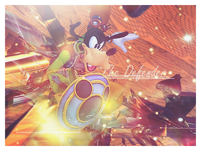
 Dispair. Dispair.

Cnc
-
Very nice. It's well blended into the background. At first I couldn't figure out what it was but now I see it some wierd person thing. By the way I think it is spelt despair not dispair.
On a different subject what is that robot thing in your other sig called? Just wondering because they look really cool.
-
 Originally Posted by Elramo

Very nice. It's well blended into the background. At first I couldn't figure out what it was but now I see it some wierd person thing. By the way I think it is spelt despair not dispair.
On a different subject what is that robot thing in your other sig called? Just wondering because they look really cool.
A robot from sector 8. I made a render of it if you want it.
-
Haha, lol it's spealt despair ratchet. Next time you should go to tools>spelling and grammar.
It helps me loads.
I liek this one a lot. You did anice job on it. Though i feel liek you did tyoo good of a job blending it. I'm having a hard time making out what it is.
Good job on text coloring and lighting though. Nice one.
 My DevART
RATCHET is my bitch
Andrew says:
u ever stolen a bible?
Apathy says:
no
used the last two pages to roll a joint though
Andrew says:
wow
thats fucking hard core
^^HAHAHA, dm sucks XD
-
hook up the render boss:P
lol..amazing job on the sig..very nice
ur style is developing into something crazy
and amazing...
loving it
-
Was just a quick render of the robot. Any choppiness should go when you resize it, if not blending removes it 

-
Way to contrast. The focal is almost gone, and it looks like your current sigs. Try mixing up your style a little more, and add a better lighting source to bring out the render more. I would've never guessed that that was the render you used if you didn't show us. Nice try, though. 6/10.
-
Originally Posted by Ultima
Way to contrast. The focal is almost gone, and it looks like your current sigs. Try mixing up your style a little more, and add a better lighting source to bring out the render more. I would've never guessed that that was the render you used if you didn't show us. Nice try, though. 6/10.
Thats a completely different render. I didn't use it in this sig.
Rather than changing my style i'm trying to slowly tweak it.
Meh to the contrast tbh.
-
-
Yeah, it was hard to figure out what it was but the effects were really nice.
 Posting Permissions
- You may not post new threads
- You may not post replies
- You may not post attachments
- You may not edit your posts
-
Forum Rules
|


 Reply With Quote