0 members and 5,896 guests
No Members online

» Site Navigation

» Stats
Members: 35,443
Threads: 103,072
Posts: 826,684
Top Poster: cc.RadillacVIII (7,429)
|
-
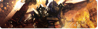
 Optimus prime. Optimus prime.
Last edited by ratchetnclank; 06-19-2008 at 09:58 AM.
-
Your diggin this darker style aren't you? 
I like it, but I think it lacks depth.
You blended him in great, with the left arm and lower right part of the body faded in and blended, but then you have his right arm, which is a foreground item blended in too.
I don't know, it might not have looked good if you hadn't, but just wanted to point that out.
Like I said though, great blending and good job with the text
-
 Originally Posted by Studhorse

Your diggin this darker style aren't you?
I like it, but I think it lacks depth.
You blended him in great, with the left arm and lower right part of the body faded in and blended, but then you have his right arm, which is a foreground item blended in too.
I don't know, it might not have looked good if you hadn't, but just wanted to point that out.
Like I said though, great blending and good job with the text
Yeah i love this style 
Thanks for pointing out the arm issue. Never noticed it. To late to do anything about it now though
Thanks for the cnc studhorse appreciate it 
-
It looks great, and yeah it's dark, like your other sigs(in your sig, at least). I think you should have done it keeping OP's famous red white and blue colors.
 Latest:

-
V3:
Less dark and optimus is easier to see (at least i hope)
-
v2 is great cuz i can see more of optimus..
i notice the slippin masks on the left top...lovin that..
text is quite good
ur style is rlly cool man
nice job..
just depth it a bit more..
-
yea ratchet v2 is way better on the first ones i could barely see optimus still a it hard but now i cant tells its a transformer lawl ur style is really good i like it allot and also great work with the text as always the only thing im not feelin is the white things on the corner still a great sig as always
newest:

Fav :

The true and only Firescorpio!
(no autographs please)
Similar Threads
-
By s0ggywaffls in forum Sigs & Manips
Replies: 2
Last Post: 02-24-2008, 08:06 AM
-
By Bloodshot in forum Sigs & Manips
Replies: 17
Last Post: 10-23-2007, 05:00 PM
-
By MR. Munke in forum Sigs & Manips
Replies: 3
Last Post: 04-09-2007, 09:07 PM
-
By RONIN in forum Sigs & Manips
Replies: 1
Last Post: 04-01-2007, 12:53 PM
-
By Tyson in forum The Void
Replies: 14
Last Post: 08-28-2005, 04:35 PM
 Posting Permissions
- You may not post new threads
- You may not post replies
- You may not post attachments
- You may not edit your posts
-
Forum Rules
|


 Reply With Quote


