GFXVoid Graphic Design Forum

Remove Text Formatting
Loading...

» Online Users: 3,473

0 members and 3,473 guests
No Members online

» Site Navigation

 > FAQ

» Stats

Members: 35,443
Threads: 103,072
Posts: 826,684
Top Poster: cc.RadillacVIII (7,429)
Welcome to our newest member, Lekelindids
Results 1 to 8 of 8

Thread: Thought.

  1. #1
    Join Date
    Oct 2007
    Posts
    2,782

    Default Thought.


    Worked with a stock this time.


  2. #2
    Join Date
    Mar 2008
    Location
    Minnesota
    Posts
    439

    Default

    very nice man good stock work fav is the black and white... hell the colored version is nice aswell
    ::new::


    ::fav::


    Quote Originally Posted by Papa View Post
    I would have prefered to see some M-birds in there. But overall pretty slick :P

  3. #3
    Join Date
    Mar 2008
    Location
    Mexico
    Posts
    391

    Default

    v1 looks kick ass it looks so subtle and great me loving it text looks great another great piece ratchet signed sealed and delivered =P
    newest:

    Fav :


    The true and only Firescorpio!
    (no autographs please)


  4. #4
    Join Date
    Feb 2008
    Location
    Toronto, Canada
    Posts
    4,831

    Default

    sweet ass job man


  5. #5
    Join Date
    Jul 2007
    Posts
    1,098

    Default

    Man, tough one.
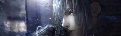
    Not that excited about the left hand side of the colored one, but the right hand side is awesome!
    Love the color fade and lighting on it.
    Great job though


  6. #6
    Join Date
    Jan 2007
    Location
    Minnesota
    Posts
    5,091

    Default

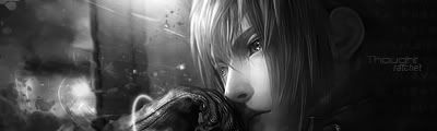
    Damn ratchet. This is your best yet! i agree i like the black and white version best but the colored version is sick too.Amazing text effects and blending. GJ.


    My DevART
    RATCHET is my bitch
    Andrew says:
    u ever stolen a bible?
    Apathy says:
    no
    used the last two pages to roll a joint though
    Andrew says:
    wow
    thats fucking hard core
    ^^HAHAHA, dm sucks XD


  7. #7
    Join Date
    Jun 2008
    Posts
    34

    Default

    Wow, amazing work ratchet. It's superneat indeed.


    ~ Black Math aka Sudden85

  8. #8
    Join Date
    Mar 2007
    Location
    Denmark
    Posts
    4,197

    Default

    Looks very good the colored one is best i think feel the sig better with that, also i think the text is decent but could be better i dont like that font really dont


Similar Threads

  1. thought..
    By robgasm in forum Digital Art
    Replies: 15
    Last Post: 08-07-2007, 12:11 AM
  2. Fruit For Thought
    By Adam in forum Digital Art
    Replies: 5
    Last Post: 10-17-2006, 01:18 PM
  3. Thought i would do somethin
    By CrazyGamer in forum Digital Art
    Replies: 7
    Last Post: 09-13-2005, 04:18 PM
  4. Thought I'd try a pop-out..
    By conspired in forum Sigs & Manips
    Replies: 19
    Last Post: 07-06-2005, 04:50 PM
  5. I made this... better than i thought it would be
    By Gocan in forum Sigs & Manips
    Replies: 5
    Last Post: 02-28-2005, 10:11 PM

Posting Permissions

  • You may not post new threads
  • You may not post replies
  • You may not post attachments
  • You may not edit your posts
  •  
Powered by vBadvanced CMPS v4.1.1