0 members and 474 guests
No Members online

» Site Navigation

» Stats
Members: 35,443
Threads: 103,072
Posts: 826,684
Top Poster: cc.RadillacVIII (7,429)
|
-

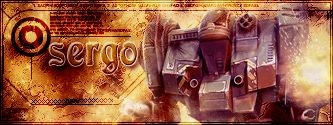
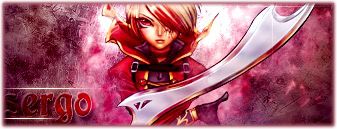
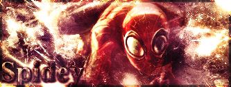
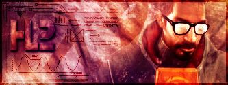
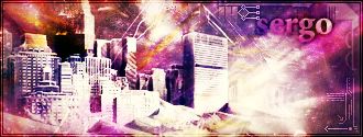
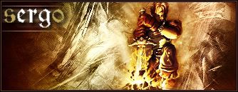
tell me what do u think about them

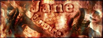
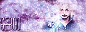
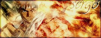

tell me what u think about my lvl
-
-
You need some work on the text and depth in the bg, itll become better 
-
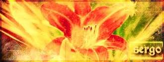
hope u like them


[IMG]http://i5.photobucket.com/albums/y178/sergo321/sunset.jpg
-
damm you made a lot of sigs... i aint gotta rate them all lol.
To me, like your font isnt always the best choice and colors, most of them have great colors, but on a few, colors aren't the best choice. From what I've seen and how long I've been on this forum (less then a day) I'd say your about average-ish lil above average. I'm not saying your bad, I like most of your sigs.
-
I'm about half tempted to go through everyone and rate and C&C all of them..God I must be bored.
Anyways you have some nice work. Though its a bit chaotic. Most of them lack direction and have way way to much going on.
LOL..if you want I could C&C them all, it might help you a bit.
-
Originally posted by Anachronism@Jun 18 2005, 08:04 AM
I'm about half tempted to go through everyone and rate and C&C all of them..God I must be bored.
Anyways you have some nice work. Though its a bit chaotic. Most of them lack direction and have way way to much going on.
LOL..if you want I could C&C them all, it might help you a bit.
[snapback]45183[/snapback]
lol i didnt ment to rate all of them i dont think u that board i just meant rate about all of them in once and what do u mean by chaotic??
-
You would be surprised how bored i am.  Lol Lol
Nah, when I said chaotic I mean some of them don't really have a focal point or they aren't brushed toward or even way from the stock image.
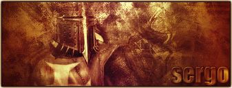
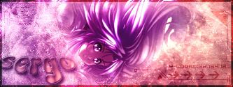
Like this one for example, I know personally that when I saw it my eyes was going back and forth between the 2 images and the typo. It doesn't really have a focal point or something to draw my attention to one point in the sig, or the sig as a whole even, but instead I was to busy trying to take everything in and find a point to focus on so it lost some of its effectiveness.
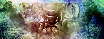
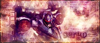
But this one, though its a bit simple (I just grabbed one of the ones that would work) has a point for my eyes to rest at or more of a focal point, because it only has one place to look at and lets my eyes rest in one spot instead going back and forth. IMO its a much better sig. Plus alot of them are brushed in random directions for no real reason.
The first 3 and the ones toward the bottom are much better sigs IMO because the stocks are blended to a point where they fit in right and the background is brushed the right way so it brings your eyes to the stock image.
Plus on a side note I think some of your sigs would look better if you had keep some of the orignal color of the stock and instead of making them a fake color you should of made them more realistic color. It gives your sigs a much stronger feel to them.
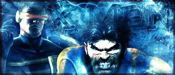
Like this one would of been a much better sig if you had kept more of its original colors in it and you just build off them. Because the purple doesn't really fit very well. Thats also one of the ones I was talking about brushing in random directions. I mean I see what your trying to do, kind of , but with the way you brushed it, it just seems a bit random instead of a strong and nice effect.
Thats what I was talking about, I mean yeah alot of this IMO type stuff but I think if you just keep in mind things like the main focus and trying to keep a more real color in your sigs and not the oversaturated color your notice that your results will turn out alot better in the end..
Overall I would give them a 6/10(thats not as bad as it might seem) Its a bit above average but I think you still have alot of work to go before you become a truly great sig maker.
See really bored.
-
first of all thx for reply but the funny thing is that u realy meant to say all in 1 word????
thx for the cooment i will try to do what u say in my next sigs just some fo them are prety old like the first one u have shown i try a little bit different style now but thx
-
..yeah thats what I meant in one word...Chaotic is a pretty open ended word and it can mean alot..
 Posting Permissions
- You may not post new threads
- You may not post replies
- You may not post attachments
- You may not edit your posts
-
Forum Rules
|


 Reply With Quote