new warcraft sig what do you think ......?
Climb-X!
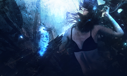
Pretty nice, the border is behind the render though. Text could also be better Everything else is nice, love the bg, single marquee rocks :P
cud use a border, and perhaps a bit blending. 8/10.
text is ugly can use a border can use some blending the bg is k nothing so nice or special about it.
Originally posted by j-3k@Jun 21 2005, 09:08 PM text is ugly [snapback]46898[/snapback] don't mean to b annoying but what makes the text annoying? On topic: yea there is something not right with the tex it just seems misplaced.
Forum Rules


 Reply With Quote
 Everything else is nice, love the bg, single marquee rocks :P