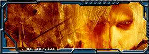
The border needs to be removed immediately never ever do that type of border. Dont do the techy border and dont bevel it (in fact, never bevel anything). Its best when it comes to typo and borders to keep it simple. Let the content of the sig be complex. The way the bg sorta fades into his face is strange. I don't like the abstract background with a render put on top (not just yours, im speaking in generalities). It could use some color as well. Many sigs that are this style are monochromatic. Maybe find an environment to put the dude in and color him correctly. I think it will look much cleaner and better overall. Also, I think you should take out that text, its not working too well.
hrmmm the border color doesnt agree w/ the inside and that kinda throws it off...theres nothing wrong w/ the tech borders...just keep practicing them and youll get better. The rest is kinda blah, so work on coloring and the bg some more. Good stuff though man.


 Reply With Quote
 never ever do that type of border. Dont do the techy border and dont bevel it (in fact, never bevel anything). Its best when it comes to typo and borders to keep it simple. Let the content of the sig be complex. The way the bg sorta fades into his face is strange. I don't like the abstract background with a render put on top (not just yours, im speaking in generalities). It could use some color as well. Many sigs that are this style are monochromatic. Maybe find an environment to put the dude in and color him correctly. I think it will look much cleaner and better overall. Also, I think you should take out that text, its not working too well.


