0 members and 6,812 guests
No Members online

» Site Navigation

» Stats
Members: 35,443
Threads: 103,072
Posts: 826,684
Top Poster: cc.RadillacVIII (7,429)
|
-

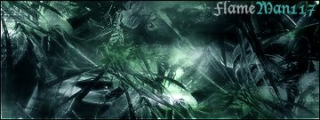
i was wondering if i should add a render to it or should i leave it alone plz help me heres the sig:

-
nah i think that it's fine without a render anyway i don't know where you would put a render it look really cool except for the text
-
thx for the comment but i dont know wat im doing wrong with the text plz comment on wat im doing wrong on it
-
is this better?
-
Thoe are Nice. brushes, can u please upload them or send me the link personaly by PMing me please...
-
Please don't add a render. About the typography, hmm... First of all, my rule is to keep text and border simple. The font is really bad. With that style, I would say a font even as simple as times new roman would be fine. I dont suggest times new roman, maybe something a little nicer. Pick a simple, clean font, sarif or not (in this particular case, i say something that isn't a sarif font, so times new roman wouldnt be very good). Don't change the color of the text (like you did between flame and man117) unless you think its needed. If you think it works better that way, then do it. Only thing relating to the color of text is, try not to use a color thats abundant in the piece. You can use another color in the color scheme, but avoid the most used color. It just fits in better that way because it still follows the colors your using, but doesnt seem too much. As for the border, stay away from that type of border with the layer style on the 1 pixel edge. Like I said, keep it simple and I think just a regular one pixel border would cover it.
-
i tried to fix the text a little more

-
nice one pls no render remembers me at the dark places (minas morgul?) from lord of the rings ... GJ
 I am the master of my soul and i am the master of my faith!
-
work on the color and text...and dont add a render
-
Originally posted by Mike_956@Jul 6 2005, 07:19 AM
i tried to fix the text a little more
[snapback]52821[/snapback]
Man, stay away from that font, as Jack said earlier use a more simple font that follows the theme of the sig whilst not detracting attention from the focal point. Please try a cleaner, more simple font.
 Posting Permissions
- You may not post new threads
- You may not post replies
- You may not post attachments
- You may not edit your posts
-
Forum Rules
|


 Reply With Quote
