GFXVoid Graphic Design Forum

Remove Text Formatting
Loading...

» Online Users: 1,916

0 members and 1,916 guests
No Members online

» Site Navigation

 > FAQ

» Stats

Members: 35,443
Threads: 103,072
Posts: 826,684
Top Poster: cc.RadillacVIII (7,429)
Welcome to our newest member, Lekelindids
Results 1 to 4 of 4

Thread: 3 Newish sigs

  1. #1
    Join Date
    Jul 2005
    Posts
    30

  2. #2
    Join Date
    May 2005
    Location
    Netherlands | Eindhoven
    Posts
    808

    Default

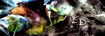
    1st sig: the render is too blended and make the stroke of text 50% or lower.., or use drop shadow, it had no colors :P

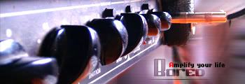
    2nd sig: Well, the render looks stretched, if u dont want it strechted ust Control T and it keeps same size but it can be smaller or bigger, dont know ho to explain. Well, the 2nd one is too plain, u should use pixel font.

    3rd one: look ok.., maybe add a border and the big text use another font..

    Srry for crits, but u wanted it, and it might help..
    Latest:


    Artist of the Week #5 deviantART Proflax

    - Splinter. - DeadlesS - TEKKEN -- Proflax -
    - Garis - Suddu - - silentshadow - jorrne - vel -
    Et tu?


  3. #3
    Join Date
    Jul 2005
    Posts
    6

    Default

    First remember to put a border on them all. 1st is overblended and the 2nd is very plain. Can't see the 3rd

  4. #4
    Join Date
    Jun 2005
    Location
    U.K.
    Posts
    3,462

    Default

    3rd one is nice..gj...nice concept..

Posting Permissions

  • You may not post new threads
  • You may not post replies
  • You may not post attachments
  • You may not edit your posts
  •  
Powered by vBadvanced CMPS v4.1.1