0 members and 1,239 guests
No Members online

» Site Navigation

» Stats
Members: 35,443
Threads: 103,072
Posts: 826,684
Top Poster: cc.RadillacVIII (7,429)
|
-

Candc please.
-
lol i thought that said "candy please" at first lol
good sig for defaults...its ver monotone tho....
-
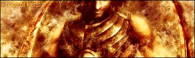
its nice, but you cut off his face?....lol, also lacks depth
-
I like it, just lower the render a bit, I wanna see his eyes.
-
Originally posted by chrisff1989@Jul 15 2005, 07:40 PM
I wanna see his eyes.
[snapback]56510[/snapback]
This is an example of what I was going to say. When people are looking at a person, what they connect with is eyes. So if you take that away, people looking at your signature wont really know where to focus. The text could use a little work. It sorta blends in with the bg too well. Id make it stand out a little more and maybe use a sarif font (congrats on not using some insane font with a whole bunch of text effects on it, your ahead of the game). The signature is a bit monotone, but its not that bad because it gives the sense of like a fiery or destructive ambience (as if the bigass swords in his arms werent enough to give it away). The background could use a little more depth, but its on its way to being more of an environment (good thing). Using defaults is a good thing, not something to tell people though. Using defaults in photoshop is what the more experienced artists use when doing brushing/digital painting. Still, like I said, no need to tell people  Anyway, overall not too bad, keep up the work. Consider doing more to this as well. Anyway, overall not too bad, keep up the work. Consider doing more to this as well.
-
Really nice, but didnt liked the font of "prince of persia" =d
-
Thanks, will work on the crit.
 Posting Permissions
- You may not post new threads
- You may not post replies
- You may not post attachments
- You may not edit your posts
-
Forum Rules
|


 Reply With Quote

