0 members and 811 guests
No Members online

» Site Navigation

» Stats
Members: 35,443
Threads: 103,072
Posts: 826,684
Top Poster: cc.RadillacVIII (7,429)
|
-

Simple, Yet I like it
-
This isn't directed at you, its more directed towards everybody that uses the word "simple" so loosely. This is not simplicity. Simplicity is a style, and I can tell you that this is not it. Simplicity typically has simple, yet often stylized shapes and few colors. The colors are few but they are more "in your face" than the typical colors because the style relies on the colors to stimulate and hold people's attention/interest.
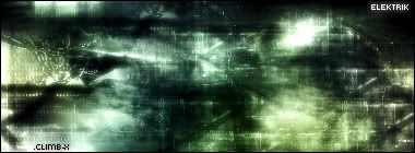
As for the signature, I like the colors, theyre cool/calming and they work well together (though im not entirely sure about the brighter green at the bottom on the right). It has a subtle tech structure yet still has a feeling of free flow (it would be increased if there were a few more curves and less sharp edges). That part is nice. Tech should always be subtle. I do find it to be a little bland though. Its nice, but doesnt hold interest very well. It needs a bit more flare and a bit more of a focal point. You might hear that a lot about a "focal point" because people need a place to focus on or else their eyes just wander and dont know where to go. A focal point gives the piece a subject. I could see this having a little more depth. If you gave this more organized structure, I'm sure it could have more depth. The typography isn't too bad. The font isn't the best choice, but it is decent (rarely do I say that about a pixel font). I do think you should get rid of the ".climb-x". Overall, its pretty good, but as I've said, you could definately improve on it 
-
thanx for the lon response, what i meant by simple was bland i guess
-
Good job elektrik, i like your style.
8/10
And Jack, in every post i've seen you in, your responses are always the longest, lol :P
-
Who Doesn't!? LOL Jk lmao. thanx for the + feedback
 Posting Permissions
- You may not post new threads
- You may not post replies
- You may not post attachments
- You may not edit your posts
-
Forum Rules
|


 Reply With Quote

