GFXVoid Graphic Design Forum

Remove Text Formatting
Loading...

» Online Users: 5,919

0 members and 5,919 guests
No Members online

» Site Navigation

 > FAQ

» Stats

Members: 35,443
Threads: 103,072
Posts: 826,684
Top Poster: cc.RadillacVIII (7,429)
Welcome to our newest member, Lekelindids
Results 1 to 6 of 6

Thread: Scorpion

  1. #1
    Join Date
    Jul 2005
    Location
    Virginia
    Posts
    1,667

    Default

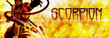
    First time trying different lighting effects, any feedback or tips would be appreciated.
    Before

    After

    -Big Time Edit-

  2. #2
    Join Date
    Jul 2005
    Posts
    40

    Default

    text is great. i love it. render works too i guess. bg is alright, its just a bit bright. ill put it this way, theres not enuff dark. also, a 1px black border would finish it up. good job tho. i love scorpion

  3. #3
    Join Date
    Jul 2005
    Location
    Virginia
    Posts
    1,667

    Default

    thx, yeah i thought i needed a better border, didnt show up when i posted it.

  4. #4
    Join Date
    Jun 2005
    Posts
    244

    Default

    right..background is way too bright/contrasted,its not pleasant to the eyes,the text is NOT good,its beveled,and a low quality font.The picture of scorpion isnt well cut out/low quality in the face area.Nice try.Keep trying

  5. #5
    Join Date
    Jun 2005
    Location
    NSW, Australia
    Posts
    3,262

    Default

    Link broken?

  6. #6
    Join Date
    Jul 2005
    Location
    Virginia
    Posts
    1,667

    Default

    Heh i appreciate your truthful thought of the sig. I did a big time edit which is in the first post.

Posting Permissions

  • You may not post new threads
  • You may not post replies
  • You may not post attachments
  • You may not edit your posts
  •  
Powered by vBadvanced CMPS v4.1.1