GFXVoid Graphic Design Forum

Remove Text Formatting
Loading...

» Online Users: 1,713

0 members and 1,713 guests
No Members online

» Site Navigation

 > FAQ

» Stats

Members: 35,443
Threads: 103,072
Posts: 826,684
Top Poster: cc.RadillacVIII (7,429)
Welcome to our newest member, Lekelindids
Results 1 to 3 of 3
  1. #1
    Join Date
    Jun 2005
    Location
    Winnipeg, MB Canada
    Posts
    38

    Default

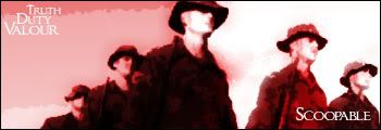
    Seen a few sigs with this kinda look... figured i'd take a shot at it... My entire family has done service in the canadian armed forces.. I am going to university and am doing so under the ROTP... so i figured why not make one for the troops...


  2. #2

    Default

    Well.. it's kinda plain ..and I've never been a fan of monochrome sigs.. but it's definitely got something. I hate plain white texts though, just looks lazy to me.


  3. #3
    Join Date
    May 2005
    Location
    Pha-Q
    Posts
    1,164

    Default

    Looks pritty good man, I like the simple look. clean and friendly

    the scoopable text looks a little choppy, id make it a little smoother looking.

    other then that very cool

Posting Permissions

  • You may not post new threads
  • You may not post replies
  • You may not post attachments
  • You may not edit your posts
  •  
Powered by vBadvanced CMPS v4.1.1