0 members and 315 guests
No Members online

» Site Navigation

» Stats
Members: 35,443
Threads: 103,073
Posts: 826,685
Top Poster: cc.RadillacVIII (7,429)
|
-

i like them, btrw im gunna change my name to fugee.

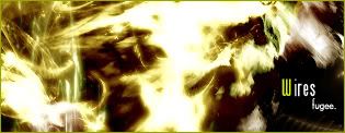
they look nicer n the white skin btw.
-
Not bad.. One the first one the text is a little hard to make out, and so is the render.. one the second one the text could use some work..
I like them both.. great job.
-
ya weell thx for the comme nt.
-
I like them both, I like the text in the 2nd one better but the text in both are pritty good. dont know what els you could do to make the text any better, its allready nice.
I like the render you picked in the first one, its a good SC render cause it fits well with the BG.
gj. 1st: 6/10
2nd: 7/10
-
The first is a bit plain.. but the second is just wild. I love it, nice text too.
so..
5/10
8/10
-
You can do a lot better.. Just work on your text..
1st one is too plain imo..
-
You can do a lot better.. Just work on your text..
1st one is too plain imo..
idk why, but i agree.
-
They're both pretty nice 
1st - You should use the Sin City effect for it, have one thing in the picture that has colour (other than the text), but good job anyway
2nd - Awesome work, only flaw is the text
-
The render on the first looks weird but nice job anyways.
6/10
8/10
-
i don't like the first one. but i think the 2nd one is very nice
 Posting Permissions
- You may not post new threads
- You may not post replies
- You may not post attachments
- You may not edit your posts
-
Forum Rules
|


 Reply With Quote

