GFXVoid Graphic Design Forum

Remove Text Formatting
Loading...

» Online Users: 2,625

0 members and 2,625 guests
No Members online

» Site Navigation

 > FAQ

» Stats

Members: 35,443
Threads: 103,072
Posts: 826,684
Top Poster: cc.RadillacVIII (7,429)
Welcome to our newest member, Lekelindids
Results 1 to 9 of 9

Thread: Few new 1s

  1. #1
    Join Date
    Aug 2005
    Posts
    27

    Default


  2. #2
    Join Date
    Aug 2005
    Location
    HK
    Posts
    2,353

    Default

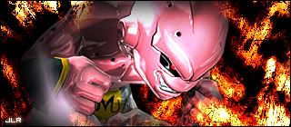
    Overall, I think it's great! But I think the render is too faded on the second sig (gotta say again, my own opinion.. :P)


    <3 Fuzzy

  3. #3
    Join Date
    Jul 2005
    Posts
    541

    Default

    nice work man..

  4. #4
    Join Date
    May 2005
    Posts
    35

    Default

    the text on the first sig isn&#39;t very good but i like it

  5. #5
    Join Date
    Jun 2005
    Location
    U.K.
    Posts
    3,462

    Default

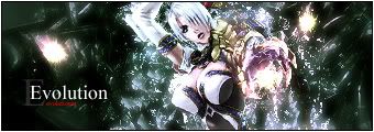
    1st one is over brushed...
    2nd one has some potential.. Work on it more and you&#39;ll have a good sig.. Blend in the render more.. Play with the dodge/burn tools.. Text flows perfectly..

  6. #6
    Join Date
    May 2005
    Posts
    179

    Default

    As Lumix just mentioned, number 2 has potential keep working on it mate, text is great.

  7. #7
    Join Date
    Jul 2005
    Location
    Virginia
    Posts
    1,667

    Default

    They look cool to me, nice job.

  8. #8
    Join Date
    May 2005
    Posts
    221

    Default

    ok stuff

  9. #9
    Join Date
    Aug 2005
    Posts
    27

    Default

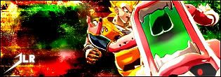
    thx a lot guys, helps great!


    got a new 1..

    this 1 is an explosion type sig after buu going crazy


    the render i do believe was from here, forget the name sorry but thx

Posting Permissions

  • You may not post new threads
  • You may not post replies
  • You may not post attachments
  • You may not edit your posts
  •  
Powered by vBadvanced CMPS v4.1.1