GFXVoid Graphic Design Forum

Remove Text Formatting
Loading...

» Online Users: 5,038

0 members and 5,038 guests
No Members online

» Site Navigation

 > FAQ

» Stats

Members: 35,443
Threads: 103,072
Posts: 826,684
Top Poster: cc.RadillacVIII (7,429)
Welcome to our newest member, Lekelindids
Page 1 of 2 12 LastLast
Results 1 to 10 of 14
  1. #1
    Join Date
    May 2005
    Location
    Texas.
    Posts
    1,584

    Default


    CnC?
    Current?
    Current Tag:


    Are you a deviant?
    I am
    www.firetap.deviantart.com


  2. #2
    Join Date
    Aug 2005
    Posts
    258

    Default

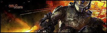
    very nice and is there a texture on the render? if so, thats hot. bg brushing could be better. text is nice. if you improve the bg brushing id say current it.

  3. #3
    Join Date
    Aug 2005
    Posts
    11

    Default

    its good...a tad bit to much of contrast/sharpen? lessen it up

  4. #4
    Join Date
    Jun 2005
    Posts
    665

    Default

    I love it, current?

    9.5/10

  5. #5
    Join Date
    Apr 2005
    Posts
    1,287

    Default

    It is too sharpened in my opinion. If you lowered that itd be much nicer. But good job

  6. #6
    Join Date
    Jul 2005
    Posts
    144

    Default

    yeah, i think the render is to sharpened a bit, but it does make it a bit unique imo =/

  7. #7
    Join Date
    Apr 2005
    Location
    long a
    Posts
    1,642

    Default

    Looks just like the wp you took it off of. I mean its good, but you could have done better, considering that right half is from the wp. 5/10

  8. #8
    Join Date
    May 2005
    Location
    Detroit
    Posts
    728

    Default

    Originally posted by MystiKal@Aug 25 2005, 12:05 AM
    you could have done better, considering that right half is from the wp.
    [snapback]72433[/snapback]
    agreed, I think you moved those bullets around a little tho. But you could have done more to it instead of just using the render nt.

  9. #9
    Join Date
    Apr 2005
    Posts
    2,093

    Default

    yea i agree as well

    i'm sure more work went into it that meets the eye, but sometimes that's not enough

  10. #10
    Join Date
    Jul 2005
    Location
    Virginia
    Posts
    1,667

    Default

    dude I love it, the sharpness of the sig makes it better to me.

Posting Permissions

  • You may not post new threads
  • You may not post replies
  • You may not post attachments
  • You may not edit your posts
  •  
Powered by vBadvanced CMPS v4.1.1