GFXVoid Graphic Design Forum

Remove Text Formatting
Loading...

» Online Users: 1,290

0 members and 1,290 guests
No Members online

» Site Navigation

 > FAQ

» Stats

Members: 35,443
Threads: 103,072
Posts: 826,684
Top Poster: cc.RadillacVIII (7,429)
Welcome to our newest member, Lekelindids
Page 1 of 2 12 LastLast
Results 1 to 10 of 12

Thread: Battle Sig

  1. #1
    Join Date
    Jul 2005
    Location
    Virginia
    Posts
    1,667

    Default

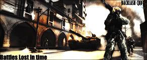
    Now if this isnt my best work im going to cry lol


  2. #2
    Join Date
    Jun 2005
    Posts
    220

    Default

    very nice, prolly ur best work :-P

    just make the text larger cos i can barely read it...

  3. #3
    Join Date
    Aug 2005
    Posts
    35

    Default

    wow nice job dude definitinly ur best work(lol i cant spell)

  4. #4
    Join Date
    Jul 2005
    Location
    London, England
    Posts
    209

    Default

    i agree with Equal, it's good and all but use wider text, or make that thin text bigger and it'd be perfect

  5. #5
    Join Date
    Jun 2005
    Location
    NSW, Australia
    Posts
    3,262

    Default

    Easily your best work, but the text is too hard to read, make it wider or use a different font, maybe impact? And it would look better

  6. #6
    Join Date
    Jul 2005
    Location
    Virginia
    Posts
    1,667

    Default

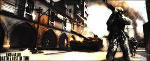
    Ok I changed the text, is this better? Should I current?


  7. #7
    Join Date
    Aug 2005
    Posts
    258

    Default

    yea def current it dude

  8. #8
    Join Date
    Aug 2005
    Posts
    4

    Default

    nice nice nice man, 10/10.

    i love that sig...and the game (bf2)

    great job

  9. #9
    Join Date
    Aug 2005
    Location
    HK
    Posts
    2,353

    Default

    Current that!!! Definately your best piece of work! 10/10. Everything looks great! Its just the text (the one with your name) is still a bit too small. Other than that, everything else is fantastic! Triple smileys for you


    <3 Fuzzy

  10. #10
    Join Date
    Apr 2005
    Posts
    1,891

    Default

    Text does need to be more wider.... other than that, I love it, nj dude....


Posting Permissions

  • You may not post new threads
  • You may not post replies
  • You may not post attachments
  • You may not edit your posts
  •  
Powered by vBadvanced CMPS v4.1.1