GFXVoid Graphic Design Forum

Remove Text Formatting
Loading...

» Online Users: 1,639

0 members and 1,639 guests
No Members online

» Site Navigation

 > FAQ

» Stats

Members: 35,443
Threads: 103,072
Posts: 826,684
Top Poster: cc.RadillacVIII (7,429)
Welcome to our newest member, Lekelindids
Results 1 to 5 of 5

Thread: Kung Fu Hustle

  1. #1
    Join Date
    Jun 2005
    Posts
    220

    Default

    V1:


    V2:


    Cnc

  2. #2
    Join Date
    Jun 2005
    Location
    NSW, Australia
    Posts
    3,262

    Default

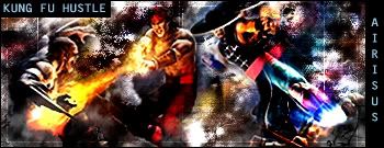
    Sorry but kind of disappointed by these, the way you put in the KUNG FU HUSTLE text doesn't look good, there are too many renders in the one sig, and the text itself needs work.

  3. #3
    Join Date
    May 2005
    Location
    Netherlands | Eindhoven
    Posts
    808

    Default

    BG + renders are cool but WAY toomuch blur on it.
    And ye, text could be different
    Latest:


    Artist of the Week #5 deviantART Proflax

    - Splinter. - DeadlesS - TEKKEN -- Proflax -
    - Garis - Suddu - - silentshadow - jorrne - vel -
    Et tu?


  4. #4
    Join Date
    Apr 2005
    Posts
    742

    Default

    text is sooo bad, and I don't think that's kung fu hustle, it looks like mortal kombat

  5. #5
    Join Date
    Jul 2005
    Location
    Virginia
    Posts
    1,667

    Default

    yeah it was alittle blurry and the text needs work, but good job overall.

Posting Permissions

  • You may not post new threads
  • You may not post replies
  • You may not post attachments
  • You may not edit your posts
  •  
Powered by vBadvanced CMPS v4.1.1