0 members and 1,650 guests
No Members online

» Site Navigation

» Stats
Members: 35,443
Threads: 103,072
Posts: 826,684
Top Poster: cc.RadillacVIII (7,429)
|
-

I haven't posted anything up for a few days so I figured while every forum I post at is dead...I would show some stuff off. Though I'm sure most of them have been seen in threads here and there already.


I didn't really do to much to this one.^
Love this one. Though I'm sure most of you won't =p
^Avatar...though I can't load it up on this forum <_<
-
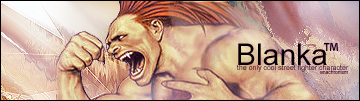
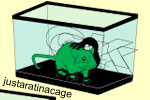
<3 them all Ana!  Especially the Blanka one, the one under that, and that rat in a cage thingy, they own! Especially the Blanka one, the one under that, and that rat in a cage thingy, they own!
Keep the good work up, and MAKE A TUT FOR ****'S SAKE! :P
-
I like Leeloo and the rat one..
Was the rat one from scratch?
-
I love the 3rd one the most for some reason. Excellent job on them all.
-
^^ Neo's style.. lol looks great
-
Woman needs sharpening to fit in, otherwise lovely.
Background colours and render colours don't match at all.
Not a big fan of...
Looks ok, could do with some improvement but I don't know what. :P
No crit, to me it's perfect, seriously well done.
Not as nice as the sig version" :P
Looks wicked. 

-
<3 That OWNS
-
Thanks for the comments =)
@lumix, yeah I did it all in AI. Though I did trace a stock of a rat. I got the idea from the pictures of my rats I have on my computer but I think I ended up using a picture off google instead of the pictures I took, because my pictures didn't have the angle I wanted. Though I think I might start making most of my sigs like this. I figure everything has been done when it comes to sig making so I'm going to try and think outside the box literally, and get rid of the rectangle shaped sigs. Since I'm far to lazy to make larger works all the time.
Though I say that now I'm sure I will be back to doing it in a week though. <_<
@Myst- Neo? Would I know him by a different name maybe? <3
After I was finished it kind of reminded me of a sig Bubu did, idea wise anyways. Doesn't really look anything like it though.
@Jakska-Leeloo's fav colors is purple and blue so I was trying to fix it into the color set some how. Though yeah your right the colors didn't match as well as I would of liked. I didn't like how I did the typo either. -_- Though she wasn't going to use it anyways so I didn't put as much work into it as most of my sigs.
Yeah I couldn't think what else to add to Blanka either. Though it seems to be missing something to give it that wow effect. Though that is what I'm worse at..the WOW. =/
I really appreciate the fact you said something about every tag. Thank you =)
@Sobek-Thanks. =) Though its not really tut worthy. I just whore defaults, smudge tool, renders, and the displace filter alot, and play around till I come up with something I think is good.
Best advice would be to just play around till you find something that looks good to you. Then on your next sig take that effect to the next lvl and just keep doing it.
After that I give you that rematch =p
@Backlash-Thanks I like that one aswell. Though I would say most of the credit should go to the guy that modeled Vincent. All I ready did was add a small render by his face. Move the background up to match the new render and his face abit, and add a few color balance layers and a invert layer at like 40% set on one of the invert blending layers to give it the non-contrast look and a typo. I just really loved the picture and didn't want to change alot about it so I wanted to add style rather then a background from scratch and so on.
@Nica-Alp-<3 thanks.
A bit out of order but I think that should be everyone. Thank you again for the comments so far.
-
-
I like the first one the best.
The only thing is, the render should be sharpened a little.
Either that or blur the background somewhat.
 Posting Permissions
- You may not post new threads
- You may not post replies
- You may not post attachments
- You may not edit your posts
-
Forum Rules
|


 Reply With Quote


