0 members and 560 guests
No Members online

» Site Navigation

» Stats
Members: 35,443
Threads: 103,072
Posts: 826,684
Top Poster: cc.RadillacVIII (7,429)
|
-

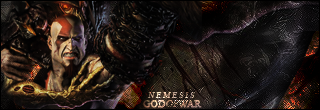
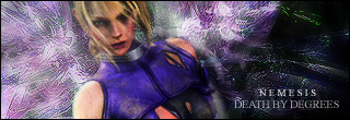
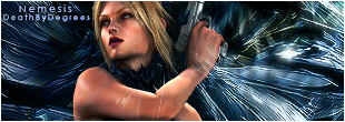
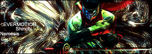
here is my latest, a new style inspired by nica.
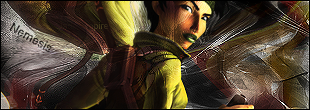 v2 v2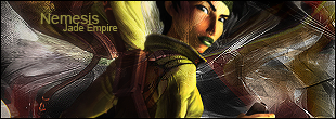
-
Top + Last ones are good  keep it up! keep it up!
-
i like how u give ur sigs that glassy look or w.e i is. I like it..
My Favorite one is the 3rd one, its depthened.
-
I don't know why.. but I like the Shinobi one a lot..
-
i'm liking the second one your text is really good it fits well in all your sigs, except the jade empire v1
-
Very nice backgrounds but I dont really think all the renders really fit
the last one owns
-
They all look good to me, excellent work.
-
thanks guys, i plan on continuing with this style.
-
Good, but seems a little low in picture quality. Maybe sharpen it a little? No so it gets those white lines though, just enough to bring out the details more.
Not really too keen on this one... The colours don't really fit well and the render looks odd on the strange tilt you have it on. The background is too sharp and the render is too blurry.
Would look great if the render and the abckground matched even SLIGHTLY in colour... They clash terribly.
Busy, but looks cool, well done.
Looks cool, but I don't like the text on this version.
v2
Much better text! I don't like the bit of brushing on her face though... looks like a scar or something.
-
4 and 5 are the best im o the text fits colors well done nj man
 Posting Permissions
- You may not post new threads
- You may not post replies
- You may not post attachments
- You may not edit your posts
-
Forum Rules
|


 Reply With Quote


