0 members and 951 guests
No Members online

» Site Navigation

» Stats
Members: 35,443
Threads: 103,072
Posts: 826,684
Top Poster: cc.RadillacVIII (7,429)
|
-

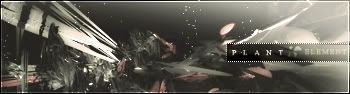
Same render as that sig from waterworld.
But I tried some more with it. Im quite confident with this one

v2
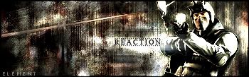
Reaction
-
Yups, I think this is really good, I see why you are confident with this one  The text is very nice and I like the whole thing. Great choice of colors too. The text is very nice and I like the whole thing. Great choice of colors too.
I wonder how you made that bubble effect *hint hint* =P Oh well, nevermind that. Once again, love your work Element. The lighting is also good if it's supposed to be there o.o
PS: This siggeh gives me a feeling that its underwater (even without the bubbles). Just a random comment on your siggeh.
-
Thanks for the comment,
As price for your first comment you'll get the bubbling answer ^^
1px brush put some scatter on it space it
dual brush 3 px also some scatter and space it
-
I like this better than the underwater one.. Nice choice of colours.. And the text is very good.. Not too sure about the border on the text tho..
-
-
i prefer v2 of the waterworld sig but both version are sweet. on the sig you just added, its very nice indeed. i really like the bg. theres a sort of depth to it imo
-
Originally posted by m3mph!s@Sep 28 2005, 06:45 PM
i prefer v2 of the waterworld sig but both version are sweet.* on the sig you just added, its very nice indeed.* i really like the bg. theres a sort of depth to it imo
[snapback]82241[/snapback]
Heya memph 
its me -revo.xthree-
-
v2 and reaction are A M A Z I N G nice ****ing job man current reaction
-
light source on reaction is off. The metal should be getting much more reflection then the person.
Plant looks awesome. God job.
-
Nice, but has a weird lack of contrast... The dull red colour isn't really complimenting the sig well either.
Much nicer. I much prefer this to version one.
S'ok. I dunno what to say to improve though...
Overall, nice work!
 Posting Permissions
- You may not post new threads
- You may not post replies
- You may not post attachments
- You may not edit your posts
-
Forum Rules
|


 Reply With Quote


