0 members and 968 guests
No Members online

» Site Navigation

» Stats
Members: 35,443
Threads: 103,072
Posts: 826,684
Top Poster: cc.RadillacVIII (7,429)
|
-

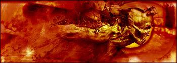
Well this sig was made with my new brushes I am making and some defaults and filters no downloaded brushes for me =). Its a pretty nice sig imo, I know it could be better. When I look at it I think of a quote, I don't know if I heard it or I just made it you let me know. I like 3 and 4 more.
"What the mind cannot comprehend, the mind will not understand"


-
3rd one.. Add more colours..
-
Yeah 4th one more colors and less contrast .
Also is the text on hs back...? If so... Bring it out a LOT more.
-
There is plenty of colors if you actually look at it, its not monotone by any means there is atleast 4 colorbalance layers. The last one is the only one with contrast and it has one levels layer none of the others have any of that. And the text is supposed to be slightly hidden, its not meant to standout. Its only there so if some one steals it and says its theirs I can point out my mark. Thank you for your comments though.
-
mon·o·tone - Sameness or dull repetition in sound, style, manner, or color.
Its monotone.
-
Originally posted by MystiKal@Oct 3 2005, 03:35 PM
mon·o·tone - Sameness or dull repetition in sound, style, manner, or color.
Its monotone.
[snapback]83631[/snapback]
Well the style, manner, and sound are the flow with the render to make it look nice. Color, I can pick a lot of colors and shades of colors out of that sig. But if you must, call it monotone.
 Posting Permissions
- You may not post new threads
- You may not post replies
- You may not post attachments
- You may not edit your posts
-
Forum Rules
|


 Reply With Quote