my new current sig. comment please
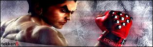
the tekken part at the bottom left is awsome how did u do it not sure bout the rest though
Climb-X!
loooks pretty good... not sure if i like that blur though.. maybe a little less of a blurred effect would make it look a little sharper.
Hold down shift when you resize the render
Originally posted by WanderingpPie@Oct 13 2005, 12:28 AM the tekken part at the bottom left is awsome how did u do it not sure bout the rest though [snapback]85740[/snapback] i used ecliptical marquee tool and set it on subtract from selction. thanks for comments
ya text is about as creative as u got
Forum Rules


comment please


 Reply With Quote