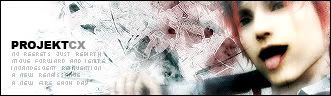
GFXVoid Graphic Design Forum

Remove Text Formatting
Loading...

» Online Users: 1,112

0 members and 1,112 guests
No Members online

» Site Navigation

 > FAQ

» Stats

Members: 35,443
Threads: 103,072
Posts: 826,684
Top Poster: cc.RadillacVIII (7,429)
Welcome to our newest member, Lekelindids
Results 1 to 7 of 7

Thread: reno

  1. #1
    Join Date
    Oct 2005
    Location
    Canada
    Posts
    176

    Default

    Reno from FF:AC

    its rather simple a few brushes with some levels and color balancing i got some a hard light blurred dup of the render over top small text underneath my name...CnC...and if you can read me back what the small text says


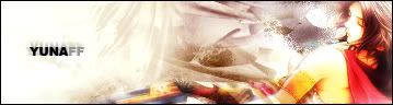
    also i made a similar one with yuna instead. thought id edit and throw it in here as well. here it is:


    CnC, suggestions. anything really, lets hear it.

  2. #2
    Join Date
    Jun 2005
    Location
    U.K.
    Posts
    3,462

    Default

    1st one is ok.. Just fix the render.. Can't really see it..

    "no regrets just rebirth move forward and ???? a new renaissance"? WTF?

    2nd one is too empty..

  3. #3
    Join Date
    Jul 2005
    Location
    Virginia
    Posts
    1,667

    Default

    Originally posted by Lumix@Oct 18 2005, 12:28 AM
    1st one is ok.. Just fix the render.. Can't really see it..

    "no regrets just rebirth move forward and ???? a new renaissance"? WTF?

    2nd one is too empty..
    [snapback]86826[/snapback]
    ^ exactly and :blink: wtf does the text say?

  4. #4
    Join Date
    Sep 2005
    Posts
    233

    Default

    and what does it mean? first one isnt bad btw.

  5. #5
    Join Date
    Oct 2005
    Location
    Canada
    Posts
    176

    Default

    no regrets just rebirth move forward and ignite incandescent reinvention a new renaisaance a new fire each day

    those of you that have heard of thrice would probably know that song. neways. thanks for the input.. anyone else? CnC, suggestions..

  6. #6
    Join Date
    Oct 2005
    Location
    Canada
    Posts
    176

    Default

    gimme some CnC..

  7. #7
    Join Date
    Aug 2005
    Posts
    9

    Default

    The simplicity is definately a good trait. It's flowing, and the text matches the desired theme. Personally, I would've made the brushing a bit less sharp to go along with the image, but it looks good regardless. I don't much like the second one overall, the brushing and render doesn't seem to stand out much.

Posting Permissions

  • You may not post new threads
  • You may not post replies
  • You may not post attachments
  • You may not edit your posts
  •  
Powered by vBadvanced CMPS v4.1.1