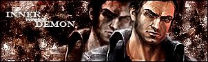
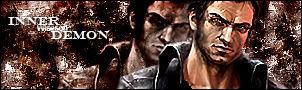
GFXVoid Graphic Design Forum

Remove Text Formatting
Loading...

» Online Users: 1,849

0 members and 1,849 guests
No Members online

» Site Navigation

 > FAQ

» Stats

Members: 35,443
Threads: 103,072
Posts: 826,684
Top Poster: cc.RadillacVIII (7,429)
Welcome to our newest member, Lekelindids
Results 1 to 3 of 3
  1. #1
    Join Date
    Jul 2005
    Location
    Virginia
    Posts
    1,667

    Default

    CnC appreciated.

    v1 - Original


    v2 - Blended the render in the back more and sharpened


    v3 - motion blur/Lighten


    v4 - Smudge effect....ghostly heh

  2. #2
    Join Date
    Jun 2005
    Location
    NSW, Australia
    Posts
    3,262

    Default

    I liked your old name better, oh well

    Looks pretty good, bg could use some improvement, i like what you've done to the render, but could be sharpened a little and made a little less opaque, and text could be improved, but keep trying

  3. #3
    Join Date
    Jul 2005
    Location
    Virginia
    Posts
    1,667

    Default

    heh yeah I love my old name, but im keeping this for now lol but thx i thought the bg need more to it and ill see what else i can do about the render.

    *edited with 3 different version*
    not that big of a difference but im tired so thats the end of this sig for now :P Text most likely wont be changed until I improve my skill more

Posting Permissions

  • You may not post new threads
  • You may not post replies
  • You may not post attachments
  • You may not edit your posts
  •  
Powered by vBadvanced CMPS v4.1.1