0 members and 5,713 guests
No Members online

» Site Navigation

» Stats
Members: 35,443
Threads: 103,072
Posts: 826,684
Top Poster: cc.RadillacVIII (7,429)
|
-
-

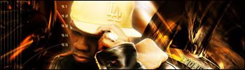
I'd like to see the stock for the 1st one..
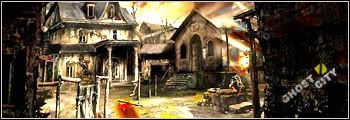
The 2nd one :
The stock is a bit too desaturated for my liking.. Bottom part of the abstract render needs smoothing out too 
-
I like the top one, though I'm not sure how much is your doing, and how much the stock. Bottom one I'm not really liking, as lumix stated, the render is very desaturated while the BG isn't. I'm also left wondering what those things in the background are, which usually isn't a good thing as it detracts from the focal point
-
-
Originally posted by Lumix@Nov 1 2005, 04:03 AM
I'd like to see the stock for the 1st one..
The 2nd one :
The stock is a bit too desaturated for my liking.. Bottom part of the abstract render needs smoothing out too
[snapback]90887[/snapback]
^ agreed, some look..burnt? :blink:
-
I agree with spluff,the first one is pretty good,even though it looks like you duplicated the original picture,and then used a soft overlay for it.
Also wondering if you made those flames out of that 'church' yourself or not.
I'm also left wondering what those things in the background are
It's probably some 3D abstract render or maby..maby it's
some 'Bling-Bling' necklace.Really don't know.
Also,at first I thought there was a cut in the back of his neck,but then I realized it was the background.
maby ya could change that,cause I don't think that's really good...blending in the picture.
-
First i made the 3d render in 3D Studio Max. Then I did the rest in photoshop.
Made all by my self exept the render (50 cent)
-
first one looks pretty cool. second one i´m not so sure about. i´d have to agree with the previous posts that his face looks to desaturated.
 Posting Permissions
- You may not post new threads
- You may not post replies
- You may not post attachments
- You may not edit your posts
-
Forum Rules
|


 Reply With Quote


