0 members and 8,407 guests
No Members online

» Site Navigation

» Stats
Members: 35,443
Threads: 103,072
Posts: 826,684
Top Poster: cc.RadillacVIII (7,429)
|
-

present for someone else on another forum, but its one of my favs at the mo...not sure why
-
-
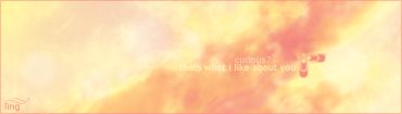
yes, yes it is. its supposed to look like clouds during a sunset or rise, ya know the whole 'red sky at night, shepards delight' or whatever 
-
that is sweet but i think a different border and what is with curious? in the text? as well i think you should a dd a bit more of the darker colours in the sig
-
it´s very nice. pleasant to look at and all. but i cant read the text. i´ll check it out again when i get home coz my monitor at work sUx so maybe that´s why i cant read the text.
-
hehe no one gets it  yeah maybe it could have used a diff border...i dunno. well the text says "curious?" next line "thats what i like about you" yeah maybe it could have used a diff border...i dunno. well the text says "curious?" next line "thats what i like about you"
the whole point is you have to look really close to read it, which only curious people would do...get it?
-
Colors are too bright to be sun set or sun rise. :P
But anyway, nice colors used, border's pretty nice imo. Just managed to see that tiny text at the bottom left corner of the signature.
Nice idea about the "Curiosity" thing, but I don't think many people will be that curious on signatures. It's bettern than your current though
-
thanks, usually if something sticks out in a sig (not always) its been done wrong. heh, well ive seen clouds that look like that, similar brightness...maybe im just wierd. anyway i shud really replace my current :S ill get round to it. other than the border any suggestions on how to improve?
-
still that curiosity thing is pretty cool oO
-
i like it. current it. the text is a good idea. i wudnt have made it so bright but if thats what you intended then its cool
 Posting Permissions
- You may not post new threads
- You may not post replies
- You may not post attachments
- You may not edit your posts
-
Forum Rules
|


 Reply With Quote

