0 members and 282 guests
No Members online

» Site Navigation

» Stats
Members: 35,443
Threads: 103,072
Posts: 826,684
Top Poster: cc.RadillacVIII (7,429)
|
-


I don't think I've ever spent this much time on a sig and been so unhappy with it.

This was a banner ad I made for a another forum..its not a graphics forum so it shouldn't be an issue.
-
-
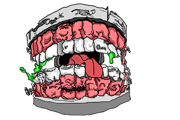
AHH stupid dial up i was looking real close at the top sig then the mouth loaded an popped up, nearly fell of ma chair, anyway back on topic.
i like the angled look in the sig and the colours fit it realy well, only real criticism is the shape on the far left looks too sharp, atleast IMO. also maybe the white border is a bit strong, starting to hurt my eyes a little
the star wars thing, well...lets just say it looks like something that coould have been in the intro or credits to starwars so they should be happy with it 
-
Yeah, I pretty much agree on the second one. That was bugging me aswell. I just haven't gone back to fix it..and I probably won't because i'm lazy and I'm sick of looking at it. If you look on the right side your see something like that(plastic wrap filter) but it smoother and doesn't stand out as much..I started with them about equal in the amount they stood out..didn't finish like that though I guess..
Thanks =)
-
all of them look nice to me the 2nd to me has a nice look but something about the left side is bothering me. overall good stuff.
-
Love the drawing, not feeling the tags too much, but you know i love your stuff.
-
-
1st one is really nice.. What's with the tongue? :P
-
Thanks, and Lumix it was the last thing I did and I got kind of lazy and just rushed it. Thats why it looks like crap. >_<
Another sig.


-
woah they look great .. brushing and smudging ?
 Posting Permissions
- You may not post new threads
- You may not post replies
- You may not post attachments
- You may not edit your posts
-
Forum Rules
|


 Reply With Quote
