0 members and 1,535 guests
No Members online

» Site Navigation

» Stats
Members: 35,443
Threads: 103,072
Posts: 826,684
Top Poster: cc.RadillacVIII (7,429)
|
-

rate it!
-
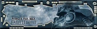
i hate rating, its so subjective. I love the render and the abstract is nice, but the outer glow on the border i'm not so keen on. Looks like you have your render on top of the border, dont know if thats your intend, but its faded out the border at the bottom right hand corner. not realy keen on the border.
But love the render, whats it from?
-
Good idea on how you made the border but what you did to it(outer glow) does't fit so well.
i hate rating, its so subjective. I love the render and the abstract is nice, but the outer glow on the border i'm not so keen on. Looks like you have your render on top of the border, dont know if thats your intend, but its faded out the border at the bottom right hand corner. not realy keen on the border.
But love the render, whats it from?
I so far haven't ever rated find it sorta the same way :P
-
Nice the border rocks....cept outer glow...gotta fix dat man...and i aint keen on text :P 
Creator of the GFXvoid Header......................................Retired GFXvoid Staff.
Currently: Never Here
-
Love the background, hate the glow on the border, get rid of it.
-
ummm yeah like what other pplz said,, its really nice but the over all look is kindda too metally
get rid of the border i guess 
-
maybe he wanted it metaly? but i agree its kinda outta der :P
Creator of the GFXvoid Header......................................Retired GFXvoid Staff.
Currently: Never Here
-
It's nice Ravon, but i gotta agree with these guys, the Border isn't that nice. i'll give you a 6/10
-
yy i dont know who it was but some1 said that glow is bad, yy he's right taht glow really sux
-
border doesn't look to great...and theres to much happenin.. 5/10
Similar Threads
-
By Ravon in forum Introductions
Replies: 6
Last Post: 04-03-2005, 05:24 AM
 Posting Permissions
- You may not post new threads
- You may not post replies
- You may not post attachments
- You may not edit your posts
-
Forum Rules
|


 Reply With Quote


